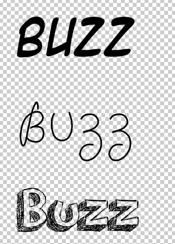
I think the genre of music of what, 'Buzz' represents is pop music this is because it suggests a vibrations of music and it also suggests
a emotion a person feels as the young generation (such as teenagers and adults)
and some people may say, ‘Feel the buzz’. Therefore the word buzz means positive emotion felt
by all age of people for a range of reasons.
Which pop music produces by playing positive and up beat music.
The target audience for this radio station logo is young children aged 5-12 years of age this is because the logo contains a lot of colour which is stereotyped to appeal to the younger generation.
Also the logo appears positive and not in any way negative this is so it shows younger children that this radio station will not play any music which is negative and may affect children.
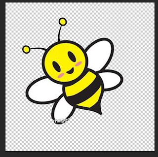
I aimed to appeal to this target audience which is children age 5-12 years of age because I used a lot of bright colours within the logo and the images used are positive and bright. (The image of a bee has a smile on it's face which shows that Buzz is a positive and cheerful radio station). Also the font style used appeals to the target audience this is because the font used appears as if it was hand draw by a children which relates to the target audience which is young children.
Potential competitors for this radio station may be, 'Capital FM' and, 'Kiss'. This is because both of these radio stations plays similar music which will be played on my radio station Buzz. Therefore I need to make sure that my radio stations stands out in a positive way this can be done by playing music more often then Capital FM and Kiss and my radio station has a different target audience compared to Capital FM and Kiss. Therefore my radio station will stand out by playing music more often and attracting a different target audience.
The look I wanted to create for my radio station logo was a positive, child friendly and fun logo. I did this by using brightly coloured images that would appeal to my target audience which is young children. I also create this look by making the logo clear to read my the audience this is so the target audience can clearly understand and read the logo without any trouble. Also I aimed this logo for young children as I imagined young children listening to the radio station's music while doing fun actives such as colouring in pictures.
I create the appearance of my Buzz logo by adding an image of a bee, I did this by using the internet's image which allowed me to chose an image of my chose and which also appeal to my target audience which is young children. I then saved the image of the bee and opened it onto Photoshop. I then changed the size of the image so it was more clear to see by the audience I did this by holding down on the keypad, 'CMD and T' then, 'Sift' this was so the proportions of the image stand equal and so the image remained clear and not pixelated. After this I deleted parts of the background of the image I did this by using the, 'Magic wand tool' which I then selected and pressed the, 'Backspace button' which then deleted the parts of the image I did not want to be seen by the audience. I then realized that some text was on the picture that I did not want to be seen so I then used the, 'Rubber tool' which I used to deleted small parts of the picture that I did not want to be seen and so the logo appeared more professional.
I then added text by using the website called www.Dafont.com which allowed me to chose any font to use in my Buzz logo. I decided to use the font called, 'Orange juice' this is because this font style appeared it be hand drawn which could be hand drawn from an child. Which represents that children help contribute towards the radio station. I then downloaded the font which I then use on Photoshop to help my Buzz logo appear more appealing and professional. I added the font onto my logo by using the, 'Text tool' I then place the tool where I wished my text to be. Next added the font and changed the sizing I did this by using the, 'Palette tool' which allowed me to change the width and length of font, I changed the width and length of the font this is so the text appear more clear to read by the target audience.
I then added a background by using the, 'Paint bucket tool' and selecting the colour white I then selected the background of the logo then the logo's background turned completely white I then decided that my logo needed to appear more interesting so I used the, 'Shapes tool' I then selected the, 'line shape' which allowed me to place the shape where I wished. I changed the colour of the line to make it more appealing and appeal to my target audience which is young children age 5-12 years of age. I changed the colour of the line by selecting the colour blue, the shape then changed to the colour of blue.
I then added images of hearts which I got from the internet's images. I saved the images and put it onto Photoshop which I then used to make my logo appear more colourful and appealing. I changed the size of the image by pressing on the keypad, 'CMD and T' then, 'Sift' which kept the image's proportions equal. I changed the image's place by rotating the image to how I wished this is so the logo appeared more professional and bold.
The most successful part of my Buzz logo is the background this is because the background of my logo is bright, colourful and interesting this then makes the logo appear more professional and appeal more to my target audience which in this case is children age 5-12 years of age. Also the background of my logo is appealing because I used many types of tools to change and make the background more appealing. I also think the background is successful because I changed the colour of the shape to make it the logo appear more colourful and to appeal to the target audience more.
The audience did think it suited to the genre of music because everyone recognized it was pop music. This is because everyone thought the use of images and text was successful and that the font style suggested pop style music. Therefore the logo clearly shown the style of music by displaying positive and colourful images and font, this was done by selecting and use brightly coloured images and changing the background of the logo to make it seem more appealing, interesting and professional.
The skills I have developed is use different style of fonts. I did this by using the website www.Dafont.com and downloading the chosen font style to use for my Buzz logo. I have developed and improved this skill because before I would have not used other sources to use different styles of font to include in my work. This is because before I would have used the text supplied by the Photoshop software, and the font styles supplied by Photoshop is limited as it is not professional and interesting to the younger generation. Therefore this shows I have developed my skills of changing and using different styles of fonts to use in my radio station logo.
My work compared to other similar logos shows that my logo stands out in an positive way this is because my logo shows use of many images and brightly coloured pictures and font styles. Whereas other logos does not include many pictures or brightly coloured backgrounds. Therefore my logo stands out to other similar logos because my logo is bright, fun and interesting.
I could improve my Buzz logo by changing the colour of the image of the bee. I could do this by adding an outer glow to apart of the image which will make the image appear more professional and bold. I did not add an outer glow to the image at the time as it would make the original seem unclear and unappealing to the target audience. Therefore I would improve this logo by adding an outer glow to a section to the image of the bee which is at the middle of the Buzz logo.
Monday, 23 December 2013
Friday, 20 December 2013
Evaluation-Pulse
I believe the name, ‘Pulse’ represents a heartbeat, and a pulse shows someone
is living and breathing. Therefore Pulse means for the radio station that music
played keeps people alive as if people depend on Pulse radio station to keep
them living and keeping people positive. Therefore this shows that this radio stations plays music which is clubbing because the logo is positive and youthful which clubbing music is all about.
The audience for this radio station is adults aged 18-30 years of age this is because the logo is not over colourful this is so the logo does not appear childish. Also the logo is suited to the target audience because there is some use of colours but a fair amount of colour used on the logo. Also the font style is bold and makes the logo seem much more appealing when this is included onto the logo of Pulse.
I aimed my logo to appeal to people aged 18-30 years of age by creating a logo that had an equal amount of colour. This means there is not too much colour used but there is evidence of colour shown. Also the logo shows use of an appealing font type this is because this logo has use of a font type that is bold and clear to read by the audience. Therefore this will appeal to the target audience because the audience will want text that can be clearly seen by makes the logo seem more professional and appealing. Therefore the text and colour used on this logo appeals to my target audience because there is a fair amount of colour used and the font style makes the logo seem more professional.
The competitors for Pulse radio station is, ‘Kiss’ and, ‘Club 1 Radio’. Both of these radio stations may become competitors for Pulse radio station because both of these stations playing clubbing music which will be played on my radio station. And both of these radio stations have similar target audiences to my radio station of Pulse. But my radio station will stand out because it will play more of a variety of clubbing style music, which will be old and new clubbing music. Rather just new clubbing music.
The look I wanted to create for Pulse radio station was an interesting, trendy and appealing logo, which appealed to 18-30 year olds. Therefore if I created a logo that appear interesting, trendy and appealing then the audience will want to listen to Pulse radio station more this is due to that fact that the logo is suited to how the audience would wish a successful radio station to appear. This is shown in my logo I have created because Pulse radio station contains interesting images, which relates to the station, which is to play clubbing style music.
I created the logo’s appearance by changing the background of the logo I did this by selecting the, ‘Paint bucket tool’ I then changed the colour of the logo to white. Next I selected the background of the logo which then turned completely white. This allowed me to create a logo to appeal my target audience. Next I added a music note I did this by selecting the, ‘Custom tool’ and selecting the music note. I then changed the colour to a light green this is so it would appeal to a male audience. I then added another picture by using the internet, to keep the propagations the same I held down on the keypad, ‘CMD and T’ then, ‘Sift’ I then chose a colour for this image which was light pink this is so it appealed to a female audience.
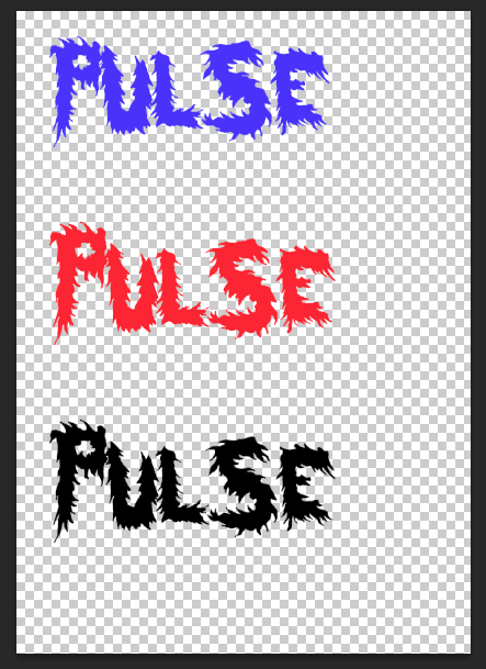
I then added a text font to my logo, I did this by using the website www.Dafont.com and choosing the font type called, ‘HairyFun’. This font style appeared professional and interesting. I then changed the colour of the font to the colour black this is so the text was clear to read by the audience. I then changed the layout of the text so the audience could read each letter of the word more carefully. I then added a background to my logo I did this by using the, ‘Shape tool’ and selecting the line, I changed the colour of the line to a red. This is so the logo appeared more bold and appealing to my target audience.
I then added another image using the internet which was of head phone, I changed the size of the image and keeping the proportions equal I did this by pressing, ‘CMD and T’ and, ‘Sift’. After I completed this deleted parts of the image I did this by selecting the, ‘Magic wand tool’ I clicked on the areas of the image which I did not want to show on my logo. After I completed this I changed the placing the image to make the picture clearer and to make the logo appear more professional. I then added another picture which was from the internet I then put this picture onto my logo and deleted parts of the background by using the, ‘Rubber tool’. This allowed me to delete parts of the image that the magic wand tool would not allow.
I think the most successful part of my radio station logo for Pulse was the way I placed images and altered them to make the logo appear more appealing to the target audience. This is because I used many images but placed them in certain areas of the logo which then made the logo appeared more professional. This is shown when I used an image of head phones and changed and placed the image where I wished but for this image I placed it on a letter this is because it represents people listening to music though the radio station of Pulse.
When I did ask my audience if it fitted the clubbing genre of music everyone agreed that it fitted with this style of music. This is because the images used suggests what type of style of music of what this radio station may play. This is because there is used of an image of head phones which show use of bold colours this shows that this radio station plays up to date and youthful music that people listen to though the use of head phones. (Head phones are seen as very youthful when seen used by people as the young generation are stereotyped to listen to music though large head phones).
The skills I have developed most when creating this logo was the use of different types of shapes. I did this by using the, 'Shape tool' which allowed me to selected a wide range of different types of shapes to be used in my logo. I have developed this skill because I have learnt to use shapes to use I wish and that I do not always need images from the internet but that I can use images from the software its self of Photoshop.
My work compared to other similar logos shows that many types of logos have to attract a certain audience, which can be done by the use of colours, images and font style. This is because my logo shows its target audience by the use of colours, images and font style. This is shown when I used colours to appeal to both genders, the font style used shows my logo appears professional and bold and the images used shows that my logo can appeal to many people. Therefore many other logos used professional images, appealing colours and bold styles of font which is shown in my logo.
I could improve this logo by making the font more colourful and bright. This is so the font attracts more of a wider audience. And makes the logo appear more appealing. Therefore I could improve my Pulse logo by changing the colour of the font to make the logo appear more bold and professional. This can be done by selecting the, 'Text tool' and choosing what colours to use.
Tuesday, 17 December 2013
Evaluation-Lock
I believe that the name, ‘Lock’ represents R&B music, as the logo needs appear
to be bright, positive and youthful. The reason I chose R&B music for this radio station logo because the word, ‘Lock’ suggests something that is hidden
away and personal to the individual. Therefore the radio station Lock plays
music, which is personal to each person.
The target audience for this radio station is 16-25 year olds of both genders. This is because the music played on this radio station will be R&B music, which is stereotyped to appeal to this age group. This is due to the fact that many 16-25 year olds listen to R&B music in a range of locations such as clubs, therefore my radio station plays up to date music, which will fit with my target audience, as the audience is 16-25 year olds. Also the logo contains use of bright colours, which will appeal to this age group as it suggests that the radio station is youthful and fun. And the colours used for the logo will appeal to both male and female this is because there is use of the colours green and orange which will appeal to males and these colours and stereotyped to appeal to this gender. And the colours purple and red and used within the logo, which are also stereotyped to appeal to females.
Also I aimed my radio station logo to appeal to people aged 16-25 this is because the logo appear fun, positive and youthful though the use of colours. This is due to the fact that the Lock logo is bright and colourful. I also wanted the use of colours to appeal to both male and female I did this by using a range of colours such as green, purple, orange and red and all of these colours appeal to both male and female aged 16-25 this is because these colours and bright and clear to read by the target audience.
The potential competitors for Lock radio station would be, ‘Capital FM’ and, ‘Radio 1’ this is due to the fact that both of these radio stations plays up to date music such as R&B which will be played on Lock radio station and which also appeals to my target audience aged 16-25 years of age. And the radio stations appeal to similar target audience compared to my, 'Lock' radio station. Therefore in order for my radio station to be more popular I need to play more R&B music which is up to date this is so that my radio station plays more music then Capital FM and Radio 1 and makes more appealing/ popular music.
The look I wished to create for Lock radio station was a fun and positive logo. Which would then tell the audience that this radio stations plays music, which is youthful, fun, positive and plays music, which is up to date which in this case, is R&B music. I also wanted to create a look for Lock radio station that applied to both male and female. I did this by using a range of different colours that would appeal to both genders.
I created the appearance of the logo by saving an image from the Internet of a key hole which I then used for my logo by saving and using on Photoshop. This chosen image was then enlarged by pressing and holding down the keys, ‘CMD and T’ then, ‘Sift’ this is so the image remains clear and appears professional. Next I added a background to the logo by using the, ‘Shape tool’. I did this by selecting the, ‘Line tool’ which then allowed me to place the line where I wished. I placed each line onto the background of the logo this is to create a more appealing and professional logo.
Next using the website, ‘www.Dafont.com’. (This website supplies a wide range of fonts). I searched though the font by selecting on the website, ‘Curly fonts’ I then found my chosen font which I would then use for my final logo which was called, ‘Cute love’. The reason why I selected this font type because it appear youthful and professional which will appeal to my target audience, which is 16-25 year olds. I then downloaded the chosen font by righting clicking on the word, ‘Download’ I then reopened my Photoshop work and clicking on the, ‘Text tool’ which allowed me to add text where I wish. After doing this I added text by finding the text I downloaded earlier by using www.Dafont.com. I then changed the size of the text by selecting the letters are by using the, ‘pallet tool’. I changed the width and length of the text to make the font appear more clear to read for the audience. Next I changed the colours of each of the four letters by selecting each letter and selecting a colour. After this my font for my logo was completed. The reason I decided to change the colours of each individual letter so the logo would appear more vibrant and bold to the audience.
The most successful part of my logo was the font type I used this is because the font relates to my target audience clearly and the colours used makes the logo stand out more to make it seem more appealing and professional. The chosen font I used was from the website www.Dafont.com I then selected the font type, ‘Cute love’ I then downloaded this font type onto my logo. This then allowed me to make my logo appear more professional by the appealing font type.
When I asked the audience for feedback on this logo everyone knew what type of music this logo was suited to this is due to the fact that this type of music for the radio station’s logo is R&B music. Therefore this logo is suited to this style of music because the logo appears youthful, positive and fun, therefore this shows that R&B music is youthful, fun and positive to listen to.
The skills I have learnt most when creating this logo for Lock radio station is downloading and using professional appearing font. Another skill I have learnt most is changing original pictures to how I wish.
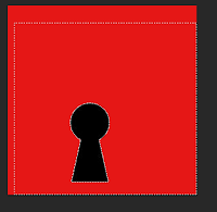 As you can see here I have saved an image onto
my Photoshop work but I then changed the size of the image by holding down the
keys, ‘CMD and T’ then, ‘Sift’ which allowed me to keep the propitiations of
the same and to keep the original clear.
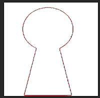 Next you can see here I deleted the background of the image I did by using the,
‘Magic wand tool’ this allowed me to deleted parts of the image where I wished.
Therefore this skill I have developed and improved on as I clearly know now how
to keep the propitiation the same and how to change an image to how I wish.
Next you can see here I deleted the background of the image I did by using the,
‘Magic wand tool’ this allowed me to deleted parts of the image where I wished.
Therefore this skill I have developed and improved on as I clearly know now how
to keep the propitiation the same and how to change an image to how I wish.My logo for Lock radio station compared to similar logos has many differences compared to other logos. This is because my logo is bright, colourful and it clearly shows the target audience for the logo. Whereas other logos don’t contain much colour and may appear to the audience as unappealing and unprofessional. But my logo appears professional and positive.
I think I could improve my logo for radio station Lock by making the background of the logo more bold and clear. I could do this by making the shape of the line wider, by changing the length and width of the line. Therefore I could improve this logo by changing the background to make it appear more bold and appealing to the target audience and the genre of music of the logo.
Friday, 13 December 2013
Feedback changes made to Pulse logo.
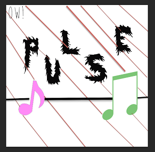 As part of my feedback I needed to add more images to my logo to make is appear more appealing to the target audience.
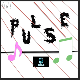 So I began by using the Internet and searching for an image named, 'Headphones'. (This is due to the fact that headphones is related to music as many people listen to their music though headphones). I then saved and uploaded this image onto my Photoshop work.
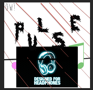 I then changed the size of the image but still keeping the propatations the same I did this by holding and pressing on the keyboard, 'CMD and T' then, 'Sift' this is so the image reminds clear and keeps the image's proportions the same.
 I then deleted parts of the background of the image I did this by using the tool, 'the magic wand tool' I clicked on the areas of the image I wished to delete and by pressing the, 'Backspace button' on the keyboard parts of that image was deleted where I wished so.
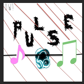 Next I wished to deleted unwanted text on the image I used the tool, 'the rubber tool' which would deleted parts of the image of where my mouse clicked. I did this so my logo was more original and appealed more to my target audience.
 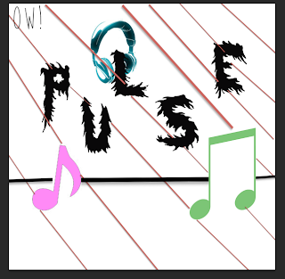 Once I had finished using the, 'rubber tool' I moved the placing of the image. I did this by pressing the image using the mouse and placing where I wished the image to be placed.
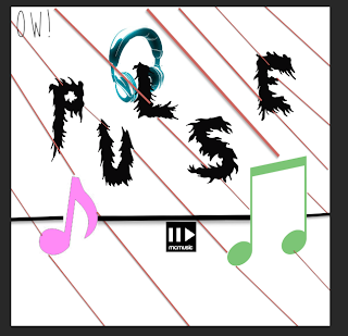 I then added another image using the Internet I searcher for, 'Music' which I then saved and uploaded onto mu Photoshop work for me to use. I added another image to make my logo seem more interesting and professional to the target audience for this radio station logo.
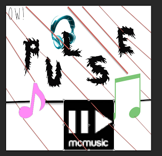 I then changed the sizing of the image by pressing and holding on the keyboard, 'CMD and T' then, 'Sift' this is so the image's proportions stayed equal and kept the image clear.
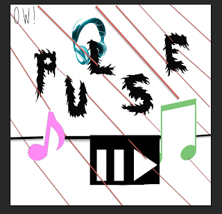 Next I deleted parts of the image by using the, 'rubber tool' which allowed me to delete parts of an image where I wished.
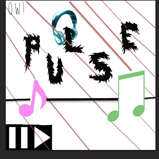 After I competed editing the image I moved the placing of the image by clicking using my mouse and changing the location of the image. This is so my Pulse logo is clear to read by the audience but appeals to the target audience at the same time. After I had completed this I had finished my Pulse logo and made changes of what others thought needed to be changed. I found this out by asking other people for feedback for my Pulse radio station logo.
Feedback changes made to Lock logo.
 For my feedback I received information that I needed to add more images to make my logo seem more appealing to my target audience.I began this by using the Internet and searching for an image that relates to my Lock logo.
I searched for an image of a, 'key' I then found an image that was
appealing and interesting. I saved the image and uploaded it onto my
Photoshop work which I then used to create more of a successful logo for Lock radio station.
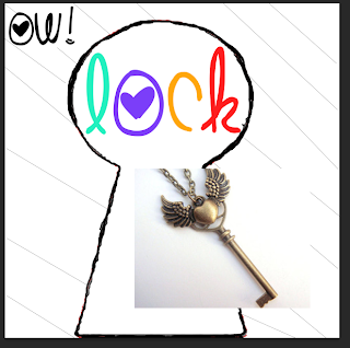 I then re sized by pressing on the keyboard, 'CMD and T' then, 'Sift' this is so the image's proportions stay the same. This is so the image does not becomes pixelated and remains clear to understand for the audience.
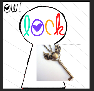 I then deleted parts of the image by using the, 'magic wand tool' I clicked on the background of the image of where I wished to no longer to be seen by the audience. This is so my logo appears more professional looking and appeals more to the target audience.
 (Here is what the logo appears so far when I completed deleting parts of the image I wish to no longer use, I did this by using the, 'magic wand tool' and clicking on the areas by pressing the, 'Backspace button' which deleted the parts of the image I wish to no longer use for my radio station logo for Lock).
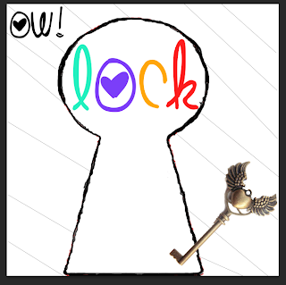 I then changed the placing of the image so the logo was more clear to the target audience as so my logo appeared more interesting and original. I changed the placing of the image by clicking on the image by using my mouse. After I completed this I had finnished the changes needed to be made to order for my logo to be more appealing to my target audience I found out this information by using other people of what was successful and unsuccessful about my logo for Lock radio station. And any parts that was said which was unsuccessful I changed which I found out from other people's feedback on the Lock radio station logo.
Feedback changes made to Buzz logo.
 For my feedback I received information that I needed to change the size of my text and adjust images on the logo
to make my logo seem more appealing to my target audience.I began this
by using the, 'palette tool' which allowed me to change the size of the text. I did this by changing the length and width of my text.
  (You can see here that I made sure the text was larger but still a correct size so it fitted onto the logo clearly).
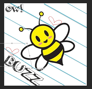 I then completed the size of the font to making it more of a larger size this is so the text becomes more bold, eye catching and more clear to read by the target audience. Also the feedback I received from my peers said that I should change the size of the font to make it larger. Which I have completed, therefore I have improved my logo to make it suit to my target audience.
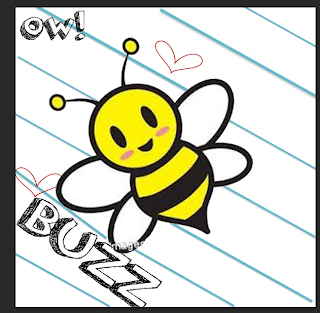 I then changed the sizes of the images of the hearts. I did this by holding, 'CMD and T' then, 'Sift'. proportions
 Tuesday, 3 December 2013
Final logos.
Here are all of my final logos:
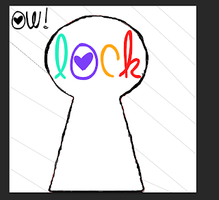 For this radio station for, 'Lock' the file format I will use will be, 'PNG' this is because it can be shared by other people quickly, the file format is supported by recent web bowers and PNG supports a high level of loss less of compression and transparency. Therefore I will use this file format because it can be shared by other people on a range of web browsers.
 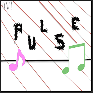 Also for this radio station's logo, 'Pulse' I will use the file format I will use will be, 'PDF' this is because it can open on any system this is because it does not run in any specific programer and I will use this type of file format because it is a very small file size which means it is easy to share with other people. Therefore the chosen file format I will use will be, 'PDF' as it can be shared easily by other people.
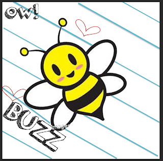 For this radio station for, 'Buzz' I will use the chosen file format which is 'JPG' this is because this file format can be shared quickly and easily by other people and this file format is widely supported standard for both digital photography and the internet. For example this file format can be shared on websites such as, 'blogger.com' so other people can see the radio station logos.
Why my logos fit together:
All three radio stations fit together because all the logos are the same length, (which is 20cm by 20cm), the logos have a stripy background but the stripes are different colours which is to show how all three logos have originality and playing a range of different music to appeal to a range of ages. Also all the logos have, 'OW!' in the corner to show what music brand it belongs to this is show the audience know that all three logos link to together. And all logos are bright and colourful which makes the radio station appear more appealing to the audience because the use of bright colours suggests that the radio stations are positive for the audience.
All three radio stations fit together because all the logos are the same length, (which is 20cm by 20cm), the logos have a stripy background but the stripes are different colours which is to show how all three logos have originality and playing a range of different music to appeal to a range of ages. Also all the logos have, 'OW!' in the corner to show what music brand it belongs to this is show the audience know that all three logos link to together. And all logos are bright and colourful which makes the radio station appear more appealing to the audience because the use of bright colours suggests that the radio stations are positive for the audience.
How they are a family:
All three logos are a family as they show use of similarities such as all three logos are bright and colourful which suggests the logos will appeal to a wide range of target audiences, the logos are all the same length and width (which is 20cm by 20cm), the background for the logos are similar (logos have a stripy background to make the logo appear more bold, appeal to the target audience more and to make the radio station's logo appear more interesting to the audience). And all three logos show they are a family of logos because the logos show the brand's name in the corner which is, 'OW!' this is to show what the logo's brands identity is.
And how they help with OW! music's brand identity:
The logos help with OW! music's brand identity because the logos state in each corner of the logo, 'OW!' this is so the audience know that all three logos are linked together, and that all the logos come from the same music brand identity. This is helpful for the audience because the audience may enjoy one radio station and if wished so the audience can listen to two other radios, this is because I have created in total three logos. Therefore all three logos help with OW! music's brand identity because it clearly states in a interesting and bold font, 'OW!' this is so the audience is aware that all three logos came from the same music brand identity.
Target audience genre.
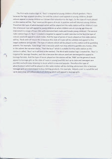
Here is my work that describes my target audience for my radio station's logos I will create using the software of, 'Photoshop'.
Friday, 29 November 2013
Music for each ident.
Kitchen Ident Music:
Playground Ident Music:
Painting Ident Music:
Sparkler Ident Music:
Playground ident:
Also for sound and music decisions for this ident we will use up beat music what sounds positive and interesting this is so the audience will want to watch this ident more if the music played appeals to the audience. And for this ident we will use music that is copyright free because the ident will appear more original if we use music that the audience have not heard before. Also in this ident there will be a narrator speaking in the background, this is so the audience clearly know what will be appearing next on the channel.
Painting ident:
For sound and music decisions in this ident we will use fast paces music in order for the ident to appear more interesting and lively. This is so the audience will want to watch the ident, more which will then lead to our ident appearing more appealing if more people wish to watch it. And for this ident we will use music that is copyright free because the ident will appear more original if we use music that the audience have not heard before.
Kitchen ident:
For sound and music decisions in this ident we will use slow pace music with no copyright this is so our music is unique and more appealing if the audience have not heard the music before. And with a narrator speaking in the background, this is so the audience clearly know what will be appearing next on the channel.
Sparkler ident:
For sound and music decisions in this ident we will use calm and relaxed music as the prop used in this ident will be slowly used therefore the prop used relates to the music, (calm, slow and relaxed), also the music selected will not be copyright this is so our ident is more original and appealing to the audience if we have used music that the audience have not heard before. Also for this ident there will be a narrator speaking this is so the audience clearly know what will be appearing next on the channel and so our ident appears more professional if both music and narration is used.
Buzz logo radio station.
 I began the, 'Buzz radio station logo' by saving and opening an image that is related to my radio station I did this by using the Internet and saving an image of a cartoon bee which I then opened onto Photoshop.
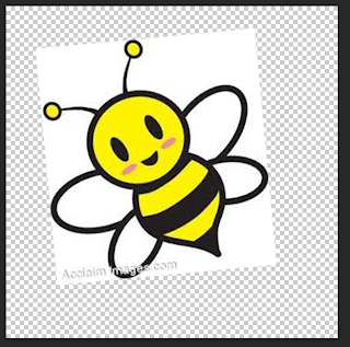 Next I made the image larger by pressing and holding, 'CMD and T' then holding on the keyboard, 'shift' so my image will still in proportion.
 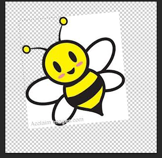 I then deleted parts of the background I did this by using the, 'Magic wand tool' which I clicked the background of the image which then highlighted and pressing the, 'backspace button' which allowed me to deleted parts of the image I wished.
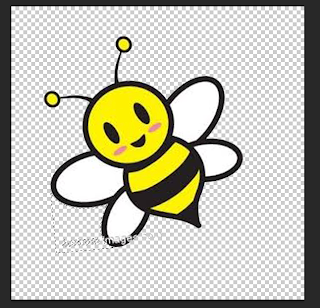 After I finished deleting the background I used the, 'Rubber tool' to delete unwanted text this is because the image included some text that I wished not to display on my logo. Therefore I used the rubber tool by clicking and holding on the area where I wish to delete.
 I then added a font text using the website, 'dafont.com' this allowed me to add a font type and the font type I downloaded to use was the font called, 'Orange juice'. I also added a background to my logo using the, 'Paint bucket tool' and selecting the colour white and clicking on the background of the logo. The background of the logo then changed white.
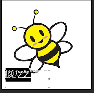 After I added my text I changed the sized my using the, 'Text tool' which allowed me to adjust the size and colour of the font.
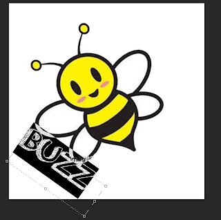 Then I used the, 'Palette tool' this was so I could change the size of the font but I changed the width and length of the font this is so the font text is more clear to read by the audience. I also changed the placing of the font I did this by pressing the arrow keys around the text. this is so my text appears more professional and interests the audience more.
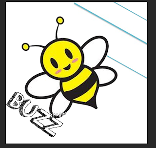 I then added more to my background this is so my logo is more appealing to the audience. I did this my using the, 'Shape tool' and selecting, 'Line' I then placed the shape where I wished.
 I then kept adding the shape background to my logo so it appears more appealing and professional to the audience.
 I then added a heart to my logo so it appeared more appealing to the audience and so my logo did not appear to plain and unattractive to the audience.
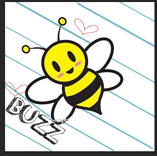 I then added another heart to the logo this is so it made the logo appear more appealing to the audience and more professional.
 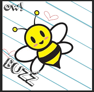 I then added text to my logo using the, 'Text tool' and using the website, 'dafont.com' and selecting/ downloading the font type, 'Orange juice'. Then on Photoshop I typed, 'Ow!' onto my logo after I added this text to my logo I completed my logo for, 'Buzz radio station logo'.
Www (What went well): My logo is bright, colourful and positive therefore more people will be interested in my radio station because the logo has represented the radio station in a positive way.
Ebi (Even better if): I could improve this logo by adding more to the logo this is so the logo attracts a wider audience because if more is added to the logo then more people will be interested in the radio station.
Shooting Schedule.

Here are my, 'Shooting schedules' for each logo. This is useful because it helps myself and Daniel when we will film our idents, what location we will film it, what prop we will use and the cast of each ident.
Drawings Of On Screen Graphics For Each Idents.
 Here is the on screen graphic for the, 'Kitchen ident'. The target audience for this on screen graphic is 18-30 this is because this ident will be filmed in the location of a kitchen which may appeal to this target audience as the audience may enjoy cooking which relates to this ident because this ident is filmed in a kitchen area where many people can cook many types of food.
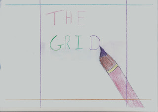 Here is the on screen graphic for the, 'Painting ident'. The target audience for this on screen graphic is 18-35 year olds this is due to the fact that the ident is about painting which can appeal to a wide range of years. But it will appeal to this certain target audience because 18-35 year olds may enjoy painting as it may be a hobby for the audience. Therefore this ident is suggests that the channel/ident is a fun channel which can inspire your talent. This is because painting/art is a talent, overall this ident suggests it will improve and inspire your talent of art.
 Here is the on screen graphic for the, 'Playground ident'. The target audience for this on screen graphic is 18-23 this is because this ident is youthful, positive and colourful. Therefore this will appeal to this target audience because the location of this ident is set outside and the props used are sports items such as basketballs which will appeal to the 18-23 as the props and the location of the ident is positive and youthful.
 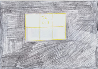 Here is the on screen graphic for the, 'Sparkler ident'. The target audience for this on screen graphic is 19-28 year olds this is because this on screen graphic appears fun and youthful this is because the on screen graphic is set during night which suggests that this ident is alive at night. This will appeal to 19-28 because this age group are stereotyped to be out at night. For example clubbing is enjoyed by people age 19-33 which shows that this ident will appeal to 19-28 year olds as the on screen graphic/ ident appears fun and youthful which will interest the target audience of 19-28 year olds.
Subscribe to:
Comments (Atom)
