Here are all my completed radio stations logos, after I made required changes in order to improve the logos, in order for them to become more successful and professional. Changes have been considered by peer's feedback, stating advance to how each logo can be improved.
 Here is one example I received back from one of peers, the information states what is required in order to improve all three of logos more efficiently.
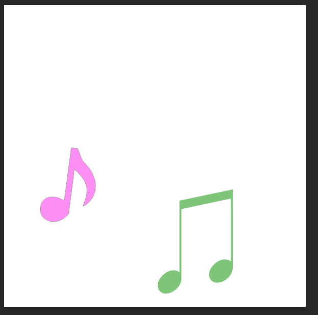
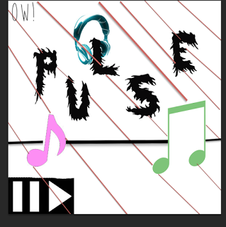 For this logo I changed the amount of images, by adding more pictures, (such as headphone on the, 'L' for, 'Pulse' and added the symbols for pause and play). I decided to add both of these images as it relates to the radio station, which is supplying music. Therefore I decided to add more images in order for the logo to become more appealing and attracts the audience's attention more efficiently.
 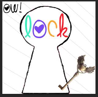 In addition I improved this logo for, 'Lock' by adding another image, (which in this case is a gold key), one of peers stated that I should add at least one more image, in order to improve the logo's appearance. So I decided to add a image related to Lock's radio station logo. In conclusion I have improved this logo by adding at least one more image, in order to improve this radio station's logo appearance in an professional manner, by considering peer's personal opinion.
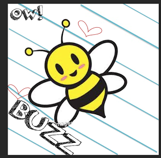 Also for this radio station logo, which in this case is, 'Buzz', I received feedback to how to improve this logo, which was increase the size of the text and images being included. So I acknowledged this feedback by increasing the size of of logo's name, 'Buzz' and increasing the size of the images being included. These changes were required and needed, as to made the audience clearly be able to understand and read the logo more easily. Therefore this logo has been improved as I have considered feedback from peers, as I wish to improve my logo in a more successful and professional manner.
Meanings behind each logo:
For the, 'Pulse' logo I have placed each letter in different heights/levels, this is so it will attract the audience's attention more efficiently, rather than having, 'Pulse' in one straight line. Pulse logo always has a black line running down the lower centre, this is to symlibce a person's pulse/heartbeat. Therefore this then means that Pulse is a radio station providing life, and new/upbeat music to an wide audience.
For the, 'Lock' logo I have included a use of a key hole this the text stating, 'Lock' inside the key's hole, there is a always an image of an key included. By including an image of a key symbolise the audience, and the key hole symbolise the radio station, 'Lock'; this then means that the audience are unlocking new music, will available for them when wished so.
In addition for the, 'Buzz' radio station logo I have included use an positive appearing image of a bee, I have included this image in order to appeal to the younger generation; this is because young children will find a bright/vibrant image more positive; this then suggests that Buzz radio station is a positive station, suitable for all ages, but targeted for young children.
Furthermore I have included use of an stripes, (lines) in all my logo's background; this is so each logo shows they are a family, (to, 'OW!') but as well making each logo attract the audience's attention more efficiently though the use of striped background.
Why my logos fit together:
All three radio stations logos fit together because all the logos are the same length, (which is 20cm by 20cm), the logos have a stripy background but the stripes are different colours which is to show how all three logos have originality and playing a range of different music to appeal to a range of ages. Also all the logos have, 'OW!' in the corner to show what music brand it belongs to this is show the audience know that all three logos link to together. And all logos are bright and colourful which makes the radio station appear more appealing to the audience because the use of bright colours suggests that the radio stations are positive for the audience.
All three radio stations logos fit together because all the logos are the same length, (which is 20cm by 20cm), the logos have a stripy background but the stripes are different colours which is to show how all three logos have originality and playing a range of different music to appeal to a range of ages. Also all the logos have, 'OW!' in the corner to show what music brand it belongs to this is show the audience know that all three logos link to together. And all logos are bright and colourful which makes the radio station appear more appealing to the audience because the use of bright colours suggests that the radio stations are positive for the audience.
How they are a family:
All three logos are a family as they show use of similarities such as all three logos are bright and colourful which suggests the logos will appeal to a wide range of target audiences, the logos are all the same length and width (which is 20cm by 20cm), the background for the logos are similar (logos have a stripy background to make the logo appear more bold, appeal to the target audience more and to make the radio station's logo appear more interesting to the audience). And all three logos show they are a family of logos because the logos show the brand's name in the corner which is, 'OW!' this is to show what the logo's brands identity is.
And how they help with OW! music's brand identity:
The logos help with OW! music's brand identity because the logos state in each corner of the logo, 'OW!' this is so the audience know that all three logos are linked together, and that all the logos come from the same music brand identity. This is helpful for the audience because the audience may enjoy one radio station and if wished so the audience can listen to two other radios, this is because I have created in total three logos. Therefore all three logos help with OW! music's brand identity because it clearly states in a interesting and bold font, 'OW!' this is so the audience is aware that all three logos came from the same music brand identity.

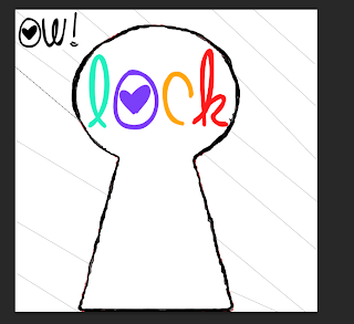 For this radio station for, 'Lock' the file format I will use will be, 'PNG' this is because it can be shared by other people quickly, the file format is supported by recent web bowers and PNG supports a high level of loss less of compression and transparency. Therefore I will use this file format because it can be shared by other people on a range of web browsers.
 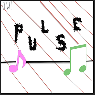 Also for this radio station's logo, 'Pulse' I will use the file format I will use will be, 'PDF' this is because it can open on any system this is because it does not run in any specific programer and I will use this type of file format because it is a very small file size which means it is easy to share with other people. Therefore the chosen file format I will use will be, 'PDF' as it can be shared easily by other people.
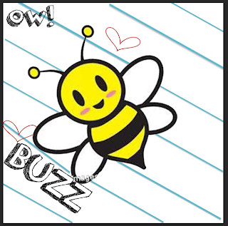 For this radio station for, 'Buzz' I will use the chosen file format which is 'JPG' this is because this file format can be shared quickly and easily by other people and this file format is widely supported standard for both digital photography and the internet. For example this file format can be shared on websites such as, 'blogger.com' so other people can see the radio station logos.



 I then added a font text using the website, 'dafont.com' this allowed me to add a font type and the font type I downloaded to use was the font called, 'Orange juice'. I also added a background to my logo using the, 'Paint bucket tool' and selecting the colour white and clicking on the background of the logo. The background of the logo then changed white.
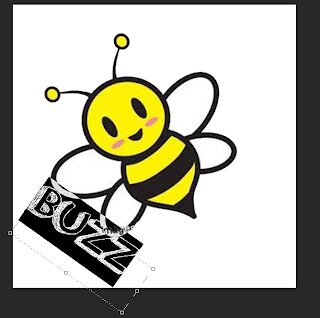 Then I used the, 'Palette tool' this was so I could change the size of the font but I changed the width and length of the font this is so the font text is more clear to read by the audience. I also changed the placing of the font I did this by pressing the arrow keys around the text. this is so my text appears more professional and interests the audience more.




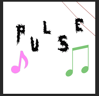 Next I added a background to my logo which was adding a red line by using the, 'shape tool' and selecting the line shape which allowed me to place the shape where I wished. I also changed the colour of the line by selecting the colours and choosing the colour red.


