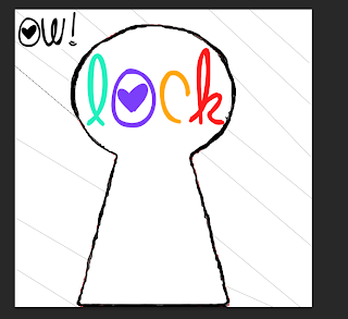
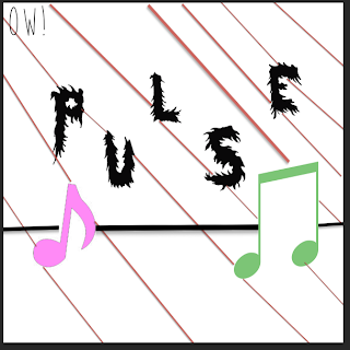
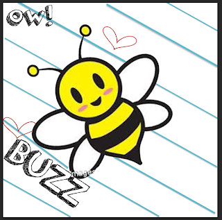
Here are all of my final logos:
 For this radio station for, 'Lock' the file format I will use will be, 'PNG' this is because it can be shared by other people quickly, the file format is supported by recent web bowers and PNG supports a high level of loss less of compression and transparency. Therefore I will use this file format because it can be shared by other people on a range of web browsers.
  Also for this radio station's logo, 'Pulse' I will use the file format I will use will be, 'PDF' this is because it can open on any system this is because it does not run in any specific programer and I will use this type of file format because it is a very small file size which means it is easy to share with other people. Therefore the chosen file format I will use will be, 'PDF' as it can be shared easily by other people.
 For this radio station for, 'Buzz' I will use the chosen file format which is 'JPG' this is because this file format can be shared quickly and easily by other people and this file format is widely supported standard for both digital photography and the internet. For example this file format can be shared on websites such as, 'blogger.com' so other people can see the radio station logos.
Why my logos fit together:
All three radio stations fit together because all the logos are the same length, (which is 20cm by 20cm), the logos have a stripy background but the stripes are different colours which is to show how all three logos have originality and playing a range of different music to appeal to a range of ages. Also all the logos have, 'OW!' in the corner to show what music brand it belongs to this is show the audience know that all three logos link to together. And all logos are bright and colourful which makes the radio station appear more appealing to the audience because the use of bright colours suggests that the radio stations are positive for the audience.
All three radio stations fit together because all the logos are the same length, (which is 20cm by 20cm), the logos have a stripy background but the stripes are different colours which is to show how all three logos have originality and playing a range of different music to appeal to a range of ages. Also all the logos have, 'OW!' in the corner to show what music brand it belongs to this is show the audience know that all three logos link to together. And all logos are bright and colourful which makes the radio station appear more appealing to the audience because the use of bright colours suggests that the radio stations are positive for the audience.
How they are a family:
All three logos are a family as they show use of similarities such as all three logos are bright and colourful which suggests the logos will appeal to a wide range of target audiences, the logos are all the same length and width (which is 20cm by 20cm), the background for the logos are similar (logos have a stripy background to make the logo appear more bold, appeal to the target audience more and to make the radio station's logo appear more interesting to the audience). And all three logos show they are a family of logos because the logos show the brand's name in the corner which is, 'OW!' this is to show what the logo's brands identity is.
And how they help with OW! music's brand identity:
The logos help with OW! music's brand identity because the logos state in each corner of the logo, 'OW!' this is so the audience know that all three logos are linked together, and that all the logos come from the same music brand identity. This is helpful for the audience because the audience may enjoy one radio station and if wished so the audience can listen to two other radios, this is because I have created in total three logos. Therefore all three logos help with OW! music's brand identity because it clearly states in a interesting and bold font, 'OW!' this is so the audience is aware that all three logos came from the same music brand identity.
No comments:
Post a Comment