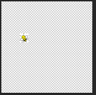
 I began the, 'Buzz radio station logo' by saving and opening an image that is related to my radio station I did this by using the Internet and saving an image of a cartoon bee which I then opened onto Photoshop.
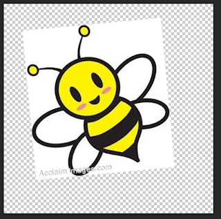 Next I made the image larger by pressing and holding, 'CMD and T' then holding on the keyboard, 'shift' so my image will still in proportion.
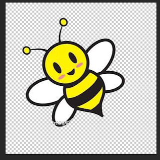
 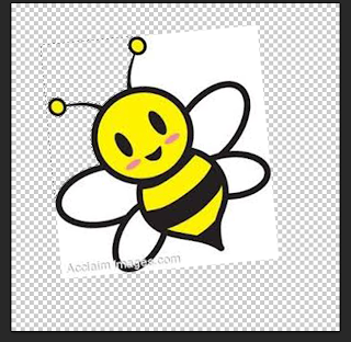 I then deleted parts of the background I did this by using the, 'Magic wand tool' which I clicked the background of the image which then highlighted and pressing the, 'backspace button' which allowed me to deleted parts of the image I wished.
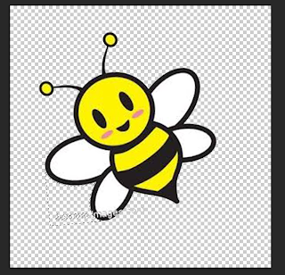 After I finished deleting the background I used the, 'Rubber tool' to delete unwanted text this is because the image included some text that I wished not to display on my logo. Therefore I used the rubber tool by clicking and holding on the area where I wish to delete.
 I then added a font text using the website, 'dafont.com' this allowed me to add a font type and the font type I downloaded to use was the font called, 'Orange juice'. I also added a background to my logo using the, 'Paint bucket tool' and selecting the colour white and clicking on the background of the logo. The background of the logo then changed white.
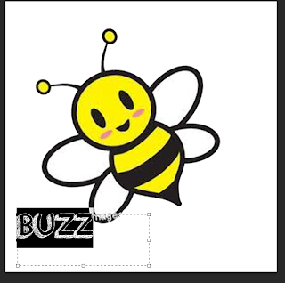 After I added my text I changed the sized my using the, 'Text tool' which allowed me to adjust the size and colour of the font.
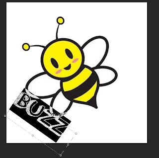 Then I used the, 'Palette tool' this was so I could change the size of the font but I changed the width and length of the font this is so the font text is more clear to read by the audience. I also changed the placing of the font I did this by pressing the arrow keys around the text. this is so my text appears more professional and interests the audience more.
 I then added more to my background this is so my logo is more appealing to the audience. I did this my using the, 'Shape tool' and selecting, 'Line' I then placed the shape where I wished.
 I then kept adding the shape background to my logo so it appears more appealing and professional to the audience.
 I then added a heart to my logo so it appeared more appealing to the audience and so my logo did not appear to plain and unattractive to the audience.
 I then added another heart to the logo this is so it made the logo appear more appealing to the audience and more professional.
  I then added text to my logo using the, 'Text tool' and using the website, 'dafont.com' and selecting/ downloading the font type, 'Orange juice'. Then on Photoshop I typed, 'Ow!' onto my logo after I added this text to my logo I completed my logo for, 'Buzz radio station logo'.
Www (What went well): My logo is bright, colourful and positive therefore more people will be interested in my radio station because the logo has represented the radio station in a positive way.
Ebi (Even better if): I could improve this logo by adding more to the logo this is so the logo attracts a wider audience because if more is added to the logo then more people will be interested in the radio station.

No comments:
Post a Comment