
For my feedback I received information that I needed to add more images to make my logo seem more appealing to my target audience.I began this by using the Internet and searching for an image that relates to my Lock logo.
I searched for an image of a, 'key' I then found an image that was
appealing and interesting. I saved the image and uploaded it onto my
Photoshop work which I then used to create more of a successful logo for Lock radio station.
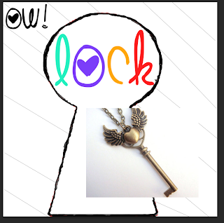
I then re sized by pressing on the keyboard, 'CMD and T' then, 'Sift' this is so the image's proportions stay the same. This is so the image does not becomes pixelated and remains clear to understand for the audience.
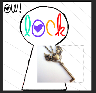
I then deleted parts of the image by using the, 'magic wand tool' I clicked on the background of the image of where I wished to no longer to be seen by the audience. This is so my logo appears more professional looking and appeals more to the target audience.

(Here is what the logo appears so far when I completed deleting parts of the image I wish to no longer use, I did this by using the, 'magic wand tool' and clicking on the areas by pressing the, 'Backspace button' which deleted the parts of the image I wish to no longer use for my radio station logo for Lock).
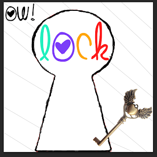
I then changed the placing of the image so the logo was more clear to the target audience as so my logo appeared more interesting and original. I changed the placing of the image by clicking on the image by using my mouse. After I completed this I had finnished the changes needed to be made to order for my logo to be more appealing to my target audience I found out this information by using other people of what was successful and unsuccessful about my logo for Lock radio station. And any parts that was said which was unsuccessful I changed which I found out from other people's feedback on the Lock radio station logo.
 For my feedback I received information that I needed to add more images to make my logo seem more appealing to my target audience.I began this by using the Internet and searching for an image that relates to my Lock logo.
I searched for an image of a, 'key' I then found an image that was
appealing and interesting. I saved the image and uploaded it onto my
Photoshop work which I then used to create more of a successful logo for Lock radio station.
 I then re sized by pressing on the keyboard, 'CMD and T' then, 'Sift' this is so the image's proportions stay the same. This is so the image does not becomes pixelated and remains clear to understand for the audience.
 I then deleted parts of the image by using the, 'magic wand tool' I clicked on the background of the image of where I wished to no longer to be seen by the audience. This is so my logo appears more professional looking and appeals more to the target audience.
 (Here is what the logo appears so far when I completed deleting parts of the image I wish to no longer use, I did this by using the, 'magic wand tool' and clicking on the areas by pressing the, 'Backspace button' which deleted the parts of the image I wish to no longer use for my radio station logo for Lock).
 I then changed the placing of the image so the logo was more clear to the target audience as so my logo appeared more interesting and original. I changed the placing of the image by clicking on the image by using my mouse. After I completed this I had finnished the changes needed to be made to order for my logo to be more appealing to my target audience I found out this information by using other people of what was successful and unsuccessful about my logo for Lock radio station. And any parts that was said which was unsuccessful I changed which I found out from other people's feedback on the Lock radio station logo.
No comments:
Post a Comment