I believe that the name, ‘Lock’ represents R&B music, as the logo needs appear
to be bright, positive and youthful. The reason I chose R&B music for this radio station logo because the word, ‘Lock’ suggests something that is hidden
away and personal to the individual. Therefore the radio station Lock plays
music, which is personal to each person.
The target audience for this radio station is 16-25 year olds of both genders. This is because the music played on this radio station will be R&B music, which is stereotyped to appeal to this age group. This is due to the fact that many 16-25 year olds listen to R&B music in a range of locations such as clubs, therefore my radio station plays up to date music, which will fit with my target audience, as the audience is 16-25 year olds. Also the logo contains use of bright colours, which will appeal to this age group as it suggests that the radio station is youthful and fun. And the colours used for the logo will appeal to both male and female this is because there is use of the colours green and orange which will appeal to males and these colours and stereotyped to appeal to this gender. And the colours purple and red and used within the logo, which are also stereotyped to appeal to females.
Also I aimed my radio station logo to appeal to people aged 16-25 this is because the logo appear fun, positive and youthful though the use of colours. This is due to the fact that the Lock logo is bright and colourful. I also wanted the use of colours to appeal to both male and female I did this by using a range of colours such as green, purple, orange and red and all of these colours appeal to both male and female aged 16-25 this is because these colours and bright and clear to read by the target audience.
The potential competitors for Lock radio station would be, ‘Capital FM’ and, ‘Radio 1’ this is due to the fact that both of these radio stations plays up to date music such as R&B which will be played on Lock radio station and which also appeals to my target audience aged 16-25 years of age. And the radio stations appeal to similar target audience compared to my, 'Lock' radio station. Therefore in order for my radio station to be more popular I need to play more R&B music which is up to date this is so that my radio station plays more music then Capital FM and Radio 1 and makes more appealing/ popular music.
The look I wished to create for Lock radio station was a fun and positive logo. Which would then tell the audience that this radio stations plays music, which is youthful, fun, positive and plays music, which is up to date which in this case, is R&B music. I also wanted to create a look for Lock radio station that applied to both male and female. I did this by using a range of different colours that would appeal to both genders.
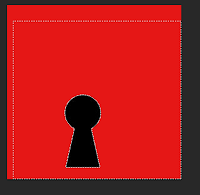
I created the appearance of the logo by saving an image from the Internet of a key hole which I then used for my logo by saving and using on Photoshop. This chosen image was then enlarged by pressing and holding down the keys, ‘CMD and T’ then, ‘Sift’ this is so the image remains clear and appears professional. Next I added a background to the logo by using the, ‘Shape tool’. I did this by selecting the, ‘Line tool’ which then allowed me to place the line where I wished. I placed each line onto the background of the logo this is to create a more appealing and professional logo.
Next using the website, ‘www.Dafont.com’. (This website supplies a wide range of fonts). I searched though the font by selecting on the website, ‘Curly fonts’ I then found my chosen font which I would then use for my final logo which was called, ‘Cute love’. The reason why I selected this font type because it appear youthful and professional which will appeal to my target audience, which is 16-25 year olds. I then downloaded the chosen font by righting clicking on the word, ‘Download’ I then reopened my Photoshop work and clicking on the, ‘Text tool’ which allowed me to add text where I wish. After doing this I added text by finding the text I downloaded earlier by using www.Dafont.com. I then changed the size of the text by selecting the letters are by using the, ‘pallet tool’. I changed the width and length of the text to make the font appear more clear to read for the audience. Next I changed the colours of each of the four letters by selecting each letter and selecting a colour. After this my font for my logo was completed. The reason I decided to change the colours of each individual letter so the logo would appear more vibrant and bold to the audience.
The most successful part of my logo was the font type I used this is because the font relates to my target audience clearly and the colours used makes the logo stand out more to make it seem more appealing and professional. The chosen font I used was from the website www.Dafont.com I then selected the font type, ‘Cute love’ I then downloaded this font type onto my logo. This then allowed me to make my logo appear more professional by the appealing font type.
When I asked the audience for feedback on this logo everyone knew what type of music this logo was suited to this is due to the fact that this type of music for the radio station’s logo is R&B music. Therefore this logo is suited to this style of music because the logo appears youthful, positive and fun, therefore this shows that R&B music is youthful, fun and positive to listen to.
The skills I have learnt most when creating this logo for Lock radio station is downloading and using professional appearing font. Another skill I have learnt most is changing original pictures to how I wish.
 As you can see here I have saved an image onto
my Photoshop work but I then changed the size of the image by holding down the
keys, ‘CMD and T’ then, ‘Sift’ which allowed me to keep the propitiations of
the same and to keep the original clear.
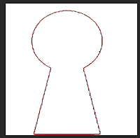
 Next you can see here I deleted the background of the image I did by using the,
‘Magic wand tool’ this allowed me to deleted parts of the image where I wished.
Therefore this skill I have developed and improved on as I clearly know now how
to keep the propitiation the same and how to change an image to how I wish.
Next you can see here I deleted the background of the image I did by using the,
‘Magic wand tool’ this allowed me to deleted parts of the image where I wished.
Therefore this skill I have developed and improved on as I clearly know now how
to keep the propitiation the same and how to change an image to how I wish.My logo for Lock radio station compared to similar logos has many differences compared to other logos. This is because my logo is bright, colourful and it clearly shows the target audience for the logo. Whereas other logos don’t contain much colour and may appear to the audience as unappealing and unprofessional. But my logo appears professional and positive.
I think I could improve my logo for radio station Lock by making the background of the logo more bold and clear. I could do this by making the shape of the line wider, by changing the length and width of the line. Therefore I could improve this logo by changing the background to make it appear more bold and appealing to the target audience and the genre of music of the logo.
No comments:
Post a Comment