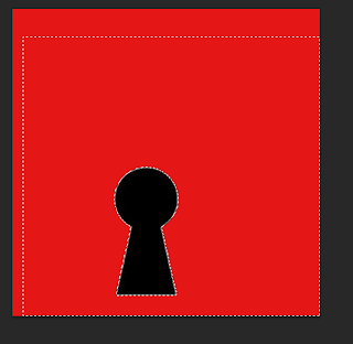
 I first began by searching on the internet of a image of a, 'key hole' I then saved my chosen image and opened it onto Photoshop.
 I then made the image larger and keeping the propitiations the same. I did this by holding, 'CMD and T' then, 'Sift'.
 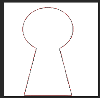 Next I changed the background of the logo by selecting the, 'Paint bucket tool' and choosing the colour white which allowed me to change the colour of the background to change it to a white background.
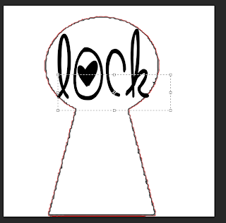
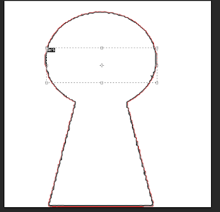 I then selected a font using the website, 'dafont.com' which I then chosen a font on this website which is called, 'Cute love'. This font type would appear appealing and professional for my logo design. I then added the chosen font to my logo by selecting the, 'Text tool' and clicking on the area I wished the text to be place.
 I then made the text larger by using the, 'Text tool' and changing the size of the text which is at the top of the menu. (The size I have chosen was 72).
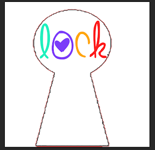 I then changed the colour of the font by selecting the, 'Text tool' and choosing the colours I would like to use for my font. (I used individual colurs for each of the four letters this is so the logo appears more bright, youthful and positive to the audience).
 Next I made the image of the key hold more bold I did this by selecting the, 'Paint brush tool' and choosing the colour black which I then slowly clicked on the areas which I wished to change colour to seem more bold and clear for the audience.
 I then added the font, 'OW!' to the logo, I did this by using the, 'Text tool' and clicking on the area where I wished the font to be placed.
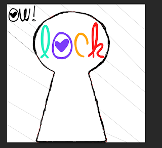 After this I added a background so my logo appeared more interesting to the audience. I did this by selecting the, 'Shape tool' and selecting, 'Line' which allowed me to put the line where I wished. Once I have completed this I have finished my logo for, 'Lock radio station'.
Www (What went well): My logo is clear to the audience of what it is and the font used which appeal to many appeal as it suggests that this radio station is positive as the use of colours and bright. (The use of bright colours suggests it is positive, happy and cheerful).
Ebi (Even better if): My logo could be improved my changing the image I used this is because the outside of the image, (the lock hole) appears rough and organized. Therefore I could improve this logo by selecting a different image so my logo appeared more professional and appealing to the audience.
No comments:
Post a Comment