 I first began by adding a music note I did this by selecting, 'custom shape' and choosing which shape to use, I then chosen the music note. After this I wished to change the colour of the design to make it more appealing I did this by selecting the, 'paint bucket tool' and choosing the colour green. I then clicked on the music note and it turned to my chosen colour which in this case is green.
 After this I changed the colour of the background by selecting the, 'Paint bucket tool' and choosing the colour white. I then clicked on the background and it turned to my chosen colour which in this case is white.
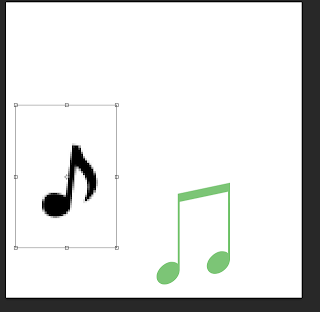 I then search on the internet for an image of different type of musical note.I then saved the image to my personal file which I then open onto Photoshop, I then enlarged the image so it was more clear to see by the audience I did this by holding, 'CMD and T' and then holding, 'Sift' which allowed the image to keep the propitiations the same, even if the image has changed in size.
 I then changed the colour of the music note I did this by selecting the, 'paint bucket tool' and choosing the colour light pink. I then clicked on the image and it changed to my chosen colour which in this case is light pink.
 I then selected a font by using the website dafont.com
choosing the font type called was, ‘HairyFun’.
I then chosen a font that fitted with this radio station which in this case is, 'Pulse'.
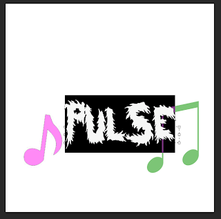 Next I changed the size of the font by using the, 'text tool' which allowed me to changed the size of the font size.
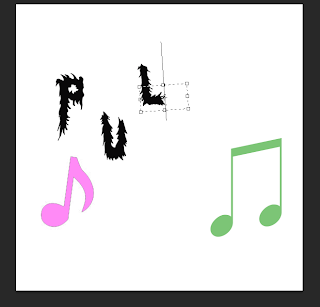 I then changed the colour of the font by selecting the colour I wish to use which in this case is the colour black. I also changed the placing of the font to make it appear more youthful, appealing and interesting to the audience.
 Next I added a background to my logo which was adding a red line by using the, 'shape tool' and selecting the line shape which allowed me to place the shape where I wished. I also changed the colour of the line by selecting the colours and choosing the colour red.
 I then kept adding the line in the background to make the logo appear more professional and colourful to the audience.
 After I did this I added a black line by selecting the, 'shape tool' and selecting the shape of the line, also I changed the colour to black by selecting the colour in the range of colours.
 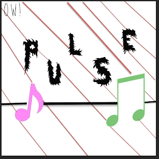 I then added the word, 'OW!' I did this by using the website, 'dafont.com' and downloading the font type, 'Moon flower' I then began using the text tool and selecting where I wished my font to be place. I then finished my logo for, 'Pulse radio station'.
 Www (What went well): The logo is related to a radio station as it contains music notes which links to playing music. Therefore this logo is clear about what it is about and what it plays, the logo is also appealing as it contains bright colours and a bold text which will attract a wider audience.
Ebi (Even better if): I could improve this logo by making the background more bold. I could do this by changing the size of the shape of the line, this is done by holding by ,'CMD and T' as well as, 'sift'. therefore I can improve this logo by making the background more bold and appealing.

No comments:
Post a Comment