All five of these music videos are the R&B music genre this is show though the style of music and shown in the video.
All five of these music videos have many conventions in common which is there is a clear use of editing, cutting, location, setting, shot types and costume. This is used so it makes the music video appear more professional and appeals more to the audience. Also the music videos all have a story line in common this is used to make the music video more interesting to watch for the audience this is due to the fact the audience may enjoy the music more if they can watch a video, (which relates to the music) while listening to the music playing. Therefore all five of these music videos have in common is that they show a clear storyline though out the videos and they show a wide range of different types of conventions such as shot types, location, editing, cutting, costume and setting. This is show in the video clips used by the website, 'www.tubechop.com'.
For this clip the audience clearly see the convention of shot types. This is due to the fact the shot type, 'over the shoulder' is used then to a, 'mid shot' this is used in all of these music videos because it shows emotions of the characters and some the audience feel apart of the video when it is filmed over the shoulder. (As if the audience is following the characters behind).
Therefore this type of convention is very common in many music videos because it makes it makes it more clear of the storyline of the video this is because it can be used to exaggerate character's emotions and show the location and setting of the video.
For this music video clip the audience clearly see the convention of the location of the video. The location relates to the emotions of the character seen in this clip. This is because the location seen is isolated and empty which then means that the character feels alone and depressed. Therefore all music videos have in common is that they all show a clear location which is shown in this video because the audience can see where it is filmed which is in an empty forest during winter.
For this music video clip the audience clearly see the convention of cutting. This has been used to make the music video more appealing to the audience as it shows a character is travelling in different areas. Also this is common in all of these music videos as it is used to show a change in location, emotions, time and characters.
This music video clip shows the convention of setting. The setting provided and suggest a youthful, fun and positive atmosphere this is because the audience clearly see many young adults enjoying themselves while listening and watching music being played. Therefore this convention suggest that this music video is positive, fun and youthful and is targeted for teenagers and adults this is because the video shows young people enjoying themselves while listening to music. This convention is very common in music videos this is due to the fact it makes the video more clear of what it may be about which then makes the music video more appealing and professional.
In this music video clip the convention shows costume, the costume shown in the video is up to date and youthful clothing. This is due to the fact the people wearing the clothing are teenagers and young adults. This is then reflected in the music video because it suggest that the music is up to date and appeals to teenagers and adults. Therefore the target audience for this music video is teenagers and adults this is due to the fact teenagers and young adults are shown wearing youthful clothing which teenagers and young adults wear today. Also this convention is very common in music videos as it makes the video more clear of what the storyline may be about and who is the target audience for this music video.
Friday, 31 January 2014

Tuesday, 28 January 2014
Music video conventions.
In all music videos that is a lot happening this is so the audience can watch the video while listening to the music being played the audience can see a range of locations, settings, movement, performance, gestures, editing/cutting and pace this is all needed to make a music video appear professional and sound appealing.
Music videos follow certain conventions this includes a meaning behind, a story line but most importantly music. This shows that music videos is not is not just about music is played it shows that music videos an interesting storyline for the audience to watch/listen to enjoy it. I found out that there is five different conventions for a music video.
So I found out that in a music video there is a clear location of where the characters are singing or acting a story which may link to the music being played in the background.
Another convention is the editing in the music video this may be used to show different types of locations or to show a change in time this is to make the music video appear more appealing and interesting to the audience watching.
Also music videos also include a range of costume which is being worn by the character/s in the music video this is so the costume relates to the music video and make the characters appear more clear to the video being played.
Music videos also include a range of shot types which is to show the location of the video and emotions of characters, therefore shot types is very important in an music video so the audience can understand the video more and understand more about the storyline being played in the music video.
And another convention in all music videos is performance this is important so the audience understand more about the storyline of the music video this can be shown by characters, facial expressions, body language and location/setting. All of these conventions are important for music videos in order for a music video to be successful, appealing and professional.
In this music video clip you can clearly see the location of the music video. (The location is a street with a young male going down the street on a bike). The location is shown to make it reliable for the audience and it make the music video become more realistic and relatable
For this music video clip the audience clearly see the character's costume this is so the audience understand more about the storyline of the music video and understand more about the video. The costume that the character's wear in this video is causal, youthful and up to date. This is so the audience understand that the song playing relates to the costume and that the music played is targeted for a younger audience this is due to the fact the costume/clothing which is seen in the video is worn by teenagers. Therefore the target audience for this music video is teenagers which relates to the costume of the characters on the music video.
This music video clip shows a range of editing/ cutting in the music video. The editing used shows different characters, character's facial expressions, creates an atmosphere and character's body language. Therefore the editing used in this clip is used to make the storyline clear to the audience of what the music video may be about.
This clip from this music video shows a range of different shot types this is to show more of the location of the video and to shows emotions of the characters in the video. Therefore different shot types is important in an music video to make the video appear more appealing and professional to the audience.
In this music video clip shows performance this is so the audience understand more about the characters within the music video. This is important so the audience relate more to the characters so they understand their emotions more which is show though their performance level. And this is shown in this music video clip as the main character is seen running looking worried which suggest the female character is running away from her problems and the audience can understand this more though the performance level of the characters which is shown though facial expressions, body language and location/setting.
Music videos follow certain conventions this includes a meaning behind, a story line but most importantly music. This shows that music videos is not is not just about music is played it shows that music videos an interesting storyline for the audience to watch/listen to enjoy it. I found out that there is five different conventions for a music video.
So I found out that in a music video there is a clear location of where the characters are singing or acting a story which may link to the music being played in the background.
Another convention is the editing in the music video this may be used to show different types of locations or to show a change in time this is to make the music video appear more appealing and interesting to the audience watching.
Also music videos also include a range of costume which is being worn by the character/s in the music video this is so the costume relates to the music video and make the characters appear more clear to the video being played.
Music videos also include a range of shot types which is to show the location of the video and emotions of characters, therefore shot types is very important in an music video so the audience can understand the video more and understand more about the storyline being played in the music video.
And another convention in all music videos is performance this is important so the audience understand more about the storyline of the music video this can be shown by characters, facial expressions, body language and location/setting. All of these conventions are important for music videos in order for a music video to be successful, appealing and professional.
In this music video clip you can clearly see the location of the music video. (The location is a street with a young male going down the street on a bike). The location is shown to make it reliable for the audience and it make the music video become more realistic and relatable
For this music video clip the audience clearly see the character's costume this is so the audience understand more about the storyline of the music video and understand more about the video. The costume that the character's wear in this video is causal, youthful and up to date. This is so the audience understand that the song playing relates to the costume and that the music played is targeted for a younger audience this is due to the fact the costume/clothing which is seen in the video is worn by teenagers. Therefore the target audience for this music video is teenagers which relates to the costume of the characters on the music video.
This music video clip shows a range of editing/ cutting in the music video. The editing used shows different characters, character's facial expressions, creates an atmosphere and character's body language. Therefore the editing used in this clip is used to make the storyline clear to the audience of what the music video may be about.
This clip from this music video shows a range of different shot types this is to show more of the location of the video and to shows emotions of the characters in the video. Therefore different shot types is important in an music video to make the video appear more appealing and professional to the audience.
In this music video clip shows performance this is so the audience understand more about the characters within the music video. This is important so the audience relate more to the characters so they understand their emotions more which is show though their performance level. And this is shown in this music video clip as the main character is seen running looking worried which suggest the female character is running away from her problems and the audience can understand this more though the performance level of the characters which is shown though facial expressions, body language and location/setting.
Friday, 17 January 2014
Creating the logo for, 'The Grid'.
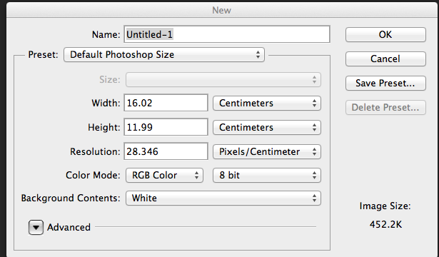 I first began by selecting the size for the layout of the logo. I made sure it was international paper, transparent and included my name.
 I then added a line using the, 'shape tool' and selecting the line shape. This allowed me to add the shape of the line where I wished. I also changed the width and length of the shape to make it more clear and bold to the audience.
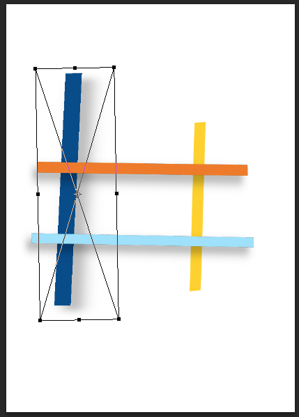 I decided to change the colours of the lines to be more colourful and bright this is so the logo appears more positive and youthful. I then added three more lines by using the, 'shape tool' which allowed me to select the shape of the lines and place where I wished. I changed the colours of the lines by selecting the colour above where of the Photoshop software. Once I selected the chose colour I finished adding the shapes of the lines to the logo of The Grid. I also added a white background to the logo to make the logo stand out more, I did this by using the, 'paint bucket tool' and selecting the colour white. I then selected the background of the logo by clicking on the background of the logo after this my background for the logo of The Grid was completed.
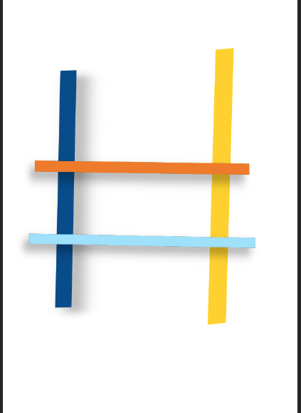 I then changed the width and the length of each line to make the logo appear more bold and clear to the audience. I did this by holding down on the keypad, 'CMD and T' then, 'Sift' this is so the proportions of the image stayed the same.
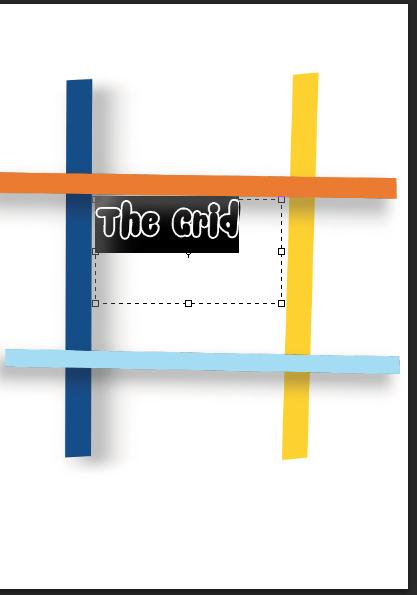 I then added text using the website www.Dafont.com. Which I then downloaded the font style, 'Snacker Comic'. I decided to use this font style because it appears professional and appealing to the target audience.
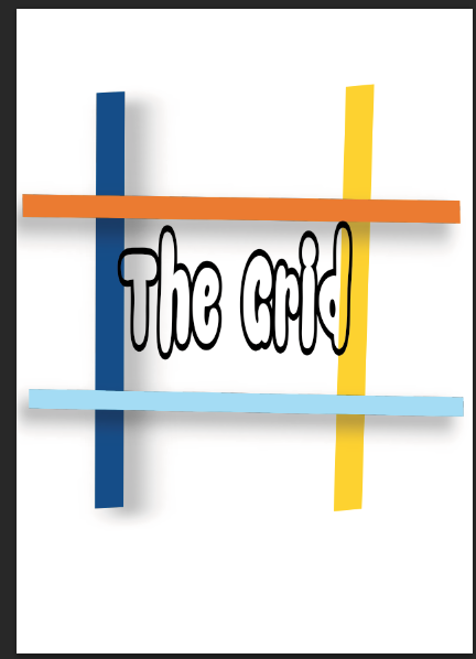 I then changed the width and size of the text by using the, 'palette tool' this allowed me to change the width and length of the text to how I wished.
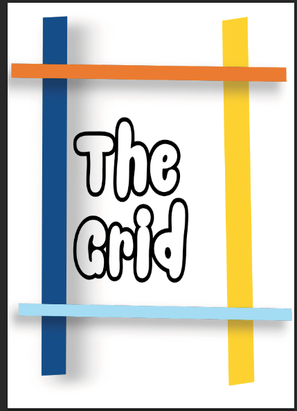 I then completed adding the text to the logo this is so the logo appears more clear to read by the target audience.
 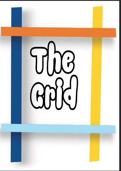 I then finished changing the size of the lines and changing the size of the text this is so The Grid logo appears more appealing and professional to the target audience. Here is the completed logo for, 'The Grid'.
 Tuesday, 14 January 2014
Feedback from peers.
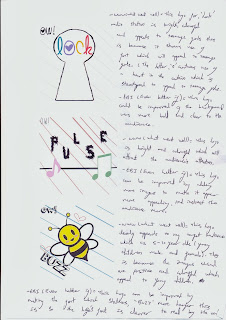 (Here are all three of my logos put together this is so my peers can evaluate the logos and see what all the logos appear when in full colours).


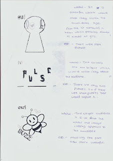
This is all the feedback I received from my peer. This is very helpful for me because it helps me to make my logos more successful and appeal more to my target audiences.
Evaluation for Lock- Proof reading.
Here I have proof read my evaluation for, 'Lock' radio station's logo, which I have created using, 'Photoshop' I found proof reading my work and adding corrections, (in red ink) very helpful as it gave me a better understanding of what is required in order to create a successful and professional final document of my final evaluation for Lock's radio station's logo.

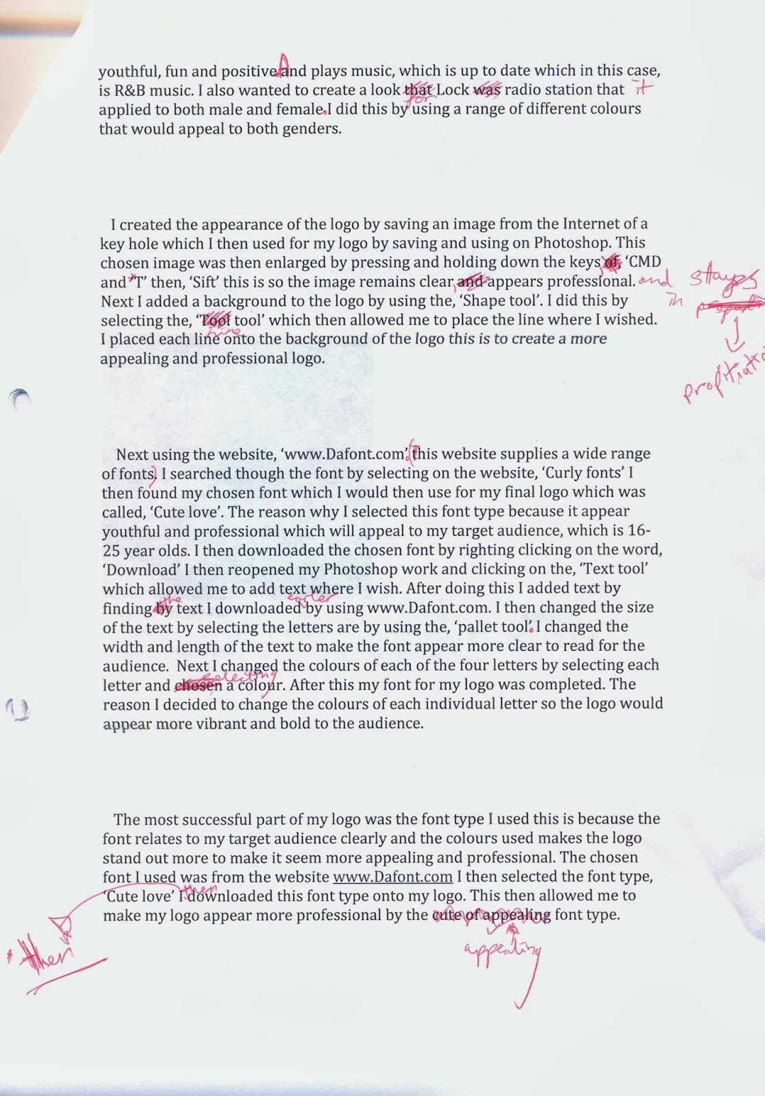

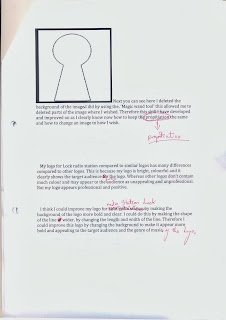
Explanation of decisions and the process of making the ident.
For creating out our finial ident we decided to change some of the placing of the props this is because we realized that making a ball bounce may not work successfully. This is due to the fact that this ident will be stop motion animation so if we wished to have footage of a ball bouncing then it would have to be clear to the target audience of what the ball is doing, which in this case in bouncing up and down to show the ball is moving all the time though out the ident. Therefore we have decided to change the ball to bouncing to the ball going though a hop. This is so the ball in the ident is clear of what the ball is doing. Therefore we have decided to change the placing of a prop which will be going though a basket ball hop.
Monday, 23 December 2013
Evalutation-Buzz.
I think the genre of music of what, 'Buzz' represents is pop music this is because it suggests a vibrations of music and it also suggests
a emotion a person feels as the young generation (such as teenagers and adults)
and some people may say, ‘Feel the buzz’. Therefore the word buzz means positive emotion felt
by all age of people for a range of reasons.
Which pop music produces by playing positive and up beat music.
The target audience for this radio station logo is young children aged 5-12 years of age this is because the logo contains a lot of colour which is stereotyped to appeal to the younger generation. Also the logo appears positive and not in any way negative this is so it shows younger children that this radio station will not play any music which is negative and may affect children.
I aimed to appeal to this target audience which is children age 5-12 years of age because I used a lot of bright colours within the logo and the images used are positive and bright. (The image of a bee has a smile on it's face which shows that Buzz is a positive and cheerful radio station). Also the font style used appeals to the target audience this is because the font used appears as if it was hand draw by a children which relates to the target audience which is young children.
Potential competitors for this radio station may be, 'Capital FM' and, 'Kiss'. This is because both of these radio stations plays similar music which will be played on my radio station Buzz. Therefore I need to make sure that my radio stations stands out in a positive way this can be done by playing music more often then Capital FM and Kiss and my radio station has a different target audience compared to Capital FM and Kiss. Therefore my radio station will stand out by playing music more often and attracting a different target audience.
The look I wanted to create for my radio station logo was a positive, child friendly and fun logo. I did this by using brightly coloured images that would appeal to my target audience which is young children. I also create this look by making the logo clear to read my the audience this is so the target audience can clearly understand and read the logo without any trouble. Also I aimed this logo for young children as I imagined young children listening to the radio station's music while doing fun actives such as colouring in pictures.
I create the appearance of my Buzz logo by adding an image of a bee, I did this by using the internet's image which allowed me to chose an image of my chose and which also appeal to my target audience which is young children. I then saved the image of the bee and opened it onto Photoshop. I then changed the size of the image so it was more clear to see by the audience I did this by holding down on the keypad, 'CMD and T' then, 'Sift' this was so the proportions of the image stand equal and so the image remained clear and not pixelated. After this I deleted parts of the background of the image I did this by using the, 'Magic wand tool' which I then selected and pressed the, 'Backspace button' which then deleted the parts of the image I did not want to be seen by the audience. I then realized that some text was on the picture that I did not want to be seen so I then used the, 'Rubber tool' which I used to deleted small parts of the picture that I did not want to be seen and so the logo appeared more professional.
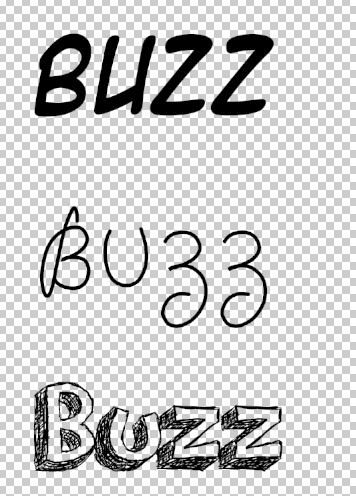
I then added text by using the website called www.Dafont.com which allowed me to chose any font to use in my Buzz logo. I decided to use the font called, 'Orange juice' this is because this font style appeared it be hand drawn which could be hand drawn from an child. Which represents that children help contribute towards the radio station. I then downloaded the font which I then use on Photoshop to help my Buzz logo appear more appealing and professional. I added the font onto my logo by using the, 'Text tool' I then place the tool where I wished my text to be. Next added the font and changed the sizing I did this by using the, 'Palette tool' which allowed me to change the width and length of font, I changed the width and length of the font this is so the text appear more clear to read by the target audience.
I then added a background by using the, 'Paint bucket tool' and selecting the colour white I then selected the background of the logo then the logo's background turned completely white I then decided that my logo needed to appear more interesting so I used the, 'Shapes tool' I then selected the, 'line shape' which allowed me to place the shape where I wished. I changed the colour of the line to make it more appealing and appeal to my target audience which is young children age 5-12 years of age. I changed the colour of the line by selecting the colour blue, the shape then changed to the colour of blue.
I then added images of hearts which I got from the internet's images. I saved the images and put it onto Photoshop which I then used to make my logo appear more colourful and appealing. I changed the size of the image by pressing on the keypad, 'CMD and T' then, 'Sift' which kept the image's proportions equal. I changed the image's place by rotating the image to how I wished this is so the logo appeared more professional and bold.
The most successful part of my Buzz logo is the background this is because the background of my logo is bright, colourful and interesting this then makes the logo appear more professional and appeal more to my target audience which in this case is children age 5-12 years of age. Also the background of my logo is appealing because I used many types of tools to change and make the background more appealing. I also think the background is successful because I changed the colour of the shape to make it the logo appear more colourful and to appeal to the target audience more.
The audience did think it suited to the genre of music because everyone recognized it was pop music. This is because everyone thought the use of images and text was successful and that the font style suggested pop style music. Therefore the logo clearly shown the style of music by displaying positive and colourful images and font, this was done by selecting and use brightly coloured images and changing the background of the logo to make it seem more appealing, interesting and professional.
The skills I have developed is use different style of fonts. I did this by using the website www.Dafont.com and downloading the chosen font style to use for my Buzz logo. I have developed and improved this skill because before I would have not used other sources to use different styles of font to include in my work. This is because before I would have used the text supplied by the Photoshop software, and the font styles supplied by Photoshop is limited as it is not professional and interesting to the younger generation. Therefore this shows I have developed my skills of changing and using different styles of fonts to use in my radio station logo.
My work compared to other similar logos shows that my logo stands out in an positive way this is because my logo shows use of many images and brightly coloured pictures and font styles. Whereas other logos does not include many pictures or brightly coloured backgrounds. Therefore my logo stands out to other similar logos because my logo is bright, fun and interesting.
I could improve my Buzz logo by changing the colour of the image of the bee. I could do this by adding an outer glow to apart of the image which will make the image appear more professional and bold. I did not add an outer glow to the image at the time as it would make the original seem unclear and unappealing to the target audience. Therefore I would improve this logo by adding an outer glow to a section to the image of the bee which is at the middle of the Buzz logo.
The target audience for this radio station logo is young children aged 5-12 years of age this is because the logo contains a lot of colour which is stereotyped to appeal to the younger generation. Also the logo appears positive and not in any way negative this is so it shows younger children that this radio station will not play any music which is negative and may affect children.
I aimed to appeal to this target audience which is children age 5-12 years of age because I used a lot of bright colours within the logo and the images used are positive and bright. (The image of a bee has a smile on it's face which shows that Buzz is a positive and cheerful radio station). Also the font style used appeals to the target audience this is because the font used appears as if it was hand draw by a children which relates to the target audience which is young children.
Potential competitors for this radio station may be, 'Capital FM' and, 'Kiss'. This is because both of these radio stations plays similar music which will be played on my radio station Buzz. Therefore I need to make sure that my radio stations stands out in a positive way this can be done by playing music more often then Capital FM and Kiss and my radio station has a different target audience compared to Capital FM and Kiss. Therefore my radio station will stand out by playing music more often and attracting a different target audience.
The look I wanted to create for my radio station logo was a positive, child friendly and fun logo. I did this by using brightly coloured images that would appeal to my target audience which is young children. I also create this look by making the logo clear to read my the audience this is so the target audience can clearly understand and read the logo without any trouble. Also I aimed this logo for young children as I imagined young children listening to the radio station's music while doing fun actives such as colouring in pictures.
I create the appearance of my Buzz logo by adding an image of a bee, I did this by using the internet's image which allowed me to chose an image of my chose and which also appeal to my target audience which is young children. I then saved the image of the bee and opened it onto Photoshop. I then changed the size of the image so it was more clear to see by the audience I did this by holding down on the keypad, 'CMD and T' then, 'Sift' this was so the proportions of the image stand equal and so the image remained clear and not pixelated. After this I deleted parts of the background of the image I did this by using the, 'Magic wand tool' which I then selected and pressed the, 'Backspace button' which then deleted the parts of the image I did not want to be seen by the audience. I then realized that some text was on the picture that I did not want to be seen so I then used the, 'Rubber tool' which I used to deleted small parts of the picture that I did not want to be seen and so the logo appeared more professional.
I then added text by using the website called www.Dafont.com which allowed me to chose any font to use in my Buzz logo. I decided to use the font called, 'Orange juice' this is because this font style appeared it be hand drawn which could be hand drawn from an child. Which represents that children help contribute towards the radio station. I then downloaded the font which I then use on Photoshop to help my Buzz logo appear more appealing and professional. I added the font onto my logo by using the, 'Text tool' I then place the tool where I wished my text to be. Next added the font and changed the sizing I did this by using the, 'Palette tool' which allowed me to change the width and length of font, I changed the width and length of the font this is so the text appear more clear to read by the target audience.
 | ||
|


I then added a background by using the, 'Paint bucket tool' and selecting the colour white I then selected the background of the logo then the logo's background turned completely white I then decided that my logo needed to appear more interesting so I used the, 'Shapes tool' I then selected the, 'line shape' which allowed me to place the shape where I wished. I changed the colour of the line to make it more appealing and appeal to my target audience which is young children age 5-12 years of age. I changed the colour of the line by selecting the colour blue, the shape then changed to the colour of blue.
I then added images of hearts which I got from the internet's images. I saved the images and put it onto Photoshop which I then used to make my logo appear more colourful and appealing. I changed the size of the image by pressing on the keypad, 'CMD and T' then, 'Sift' which kept the image's proportions equal. I changed the image's place by rotating the image to how I wished this is so the logo appeared more professional and bold.
The most successful part of my Buzz logo is the background this is because the background of my logo is bright, colourful and interesting this then makes the logo appear more professional and appeal more to my target audience which in this case is children age 5-12 years of age. Also the background of my logo is appealing because I used many types of tools to change and make the background more appealing. I also think the background is successful because I changed the colour of the shape to make it the logo appear more colourful and to appeal to the target audience more.
The audience did think it suited to the genre of music because everyone recognized it was pop music. This is because everyone thought the use of images and text was successful and that the font style suggested pop style music. Therefore the logo clearly shown the style of music by displaying positive and colourful images and font, this was done by selecting and use brightly coloured images and changing the background of the logo to make it seem more appealing, interesting and professional.
The skills I have developed is use different style of fonts. I did this by using the website www.Dafont.com and downloading the chosen font style to use for my Buzz logo. I have developed and improved this skill because before I would have not used other sources to use different styles of font to include in my work. This is because before I would have used the text supplied by the Photoshop software, and the font styles supplied by Photoshop is limited as it is not professional and interesting to the younger generation. Therefore this shows I have developed my skills of changing and using different styles of fonts to use in my radio station logo.
My work compared to other similar logos shows that my logo stands out in an positive way this is because my logo shows use of many images and brightly coloured pictures and font styles. Whereas other logos does not include many pictures or brightly coloured backgrounds. Therefore my logo stands out to other similar logos because my logo is bright, fun and interesting.
I could improve my Buzz logo by changing the colour of the image of the bee. I could do this by adding an outer glow to apart of the image which will make the image appear more professional and bold. I did not add an outer glow to the image at the time as it would make the original seem unclear and unappealing to the target audience. Therefore I would improve this logo by adding an outer glow to a section to the image of the bee which is at the middle of the Buzz logo.
Subscribe to:
Posts (Atom)