Kitchen Ident Music:
Playground Ident Music:
Painting Ident Music:
Sparkler Ident Music:
Playground ident:
Also for sound and music decisions
for this ident we will use up beat music what sounds positive and interesting
this is so the audience will want to watch this ident more if the music played
appeals to the audience. And for this ident we will use music that is copyright
free because the ident will appear more original if we use music that the
audience have not heard before. Also in this ident there will be a narrator
speaking in the background, this is so the audience clearly know what will be
appearing next on the channel.
Painting ident:
For sound and music decisions in this ident we
will use fast paces music in order for the ident to appear more interesting and
lively. This is so the audience will want to watch the ident, more which will
then lead to our ident appearing more appealing if more people wish to watch
it. And for this ident we will use music that is copyright free because the
ident will appear more original if we use music that the audience have not
heard before.
Kitchen ident:
For
sound and music decisions in this ident we will use slow pace music with no
copyright this is so our music is unique and more appealing if the audience
have not heard the music before. And with a narrator speaking in the
background, this is so the audience clearly know what will be appearing next on
the channel.
Sparkler ident:
For sound and music decisions in this ident we
will use calm and relaxed music as the prop used in this ident will be slowly
used therefore the prop used relates to the music, (calm, slow and relaxed),
also the music selected will not be copyright this is so our ident is more
original and appealing to the audience if we have used music that the audience
have not heard before. Also for this ident there will be a narrator speaking
this is so the audience clearly know what will be appearing next on the channel
and so our ident appears more professional if both music and narration is used.
Friday, 29 November 2013

Buzz logo radio station.
 I began the, 'Buzz radio station logo' by saving and opening an image that is related to my radio station I did this by using the Internet and saving an image of a cartoon bee which I then opened onto Photoshop.
 Next I made the image larger by pressing and holding, 'CMD and T' then holding on the keyboard, 'shift' so my image will still in proportion.
  I then deleted parts of the background I did this by using the, 'Magic wand tool' which I clicked the background of the image which then highlighted and pressing the, 'backspace button' which allowed me to deleted parts of the image I wished.
 After I finished deleting the background I used the, 'Rubber tool' to delete unwanted text this is because the image included some text that I wished not to display on my logo. Therefore I used the rubber tool by clicking and holding on the area where I wish to delete.
 After I finished using the rubber tool my logo looked like this so far.
 I then added a font text using the website, 'dafont.com' this allowed me to add a font type and the font type I downloaded to use was the font called, 'Orange juice'. I also added a background to my logo using the, 'Paint bucket tool' and selecting the colour white and clicking on the background of the logo. The background of the logo then changed white.
 After I added my text I changed the sized my using the, 'Text tool' which allowed me to adjust the size and colour of the font.
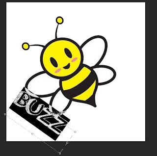 Then I used the, 'Palette tool' this was so I could change the size of the font but I changed the width and length of the font this is so the font text is more clear to read by the audience. I also changed the placing of the font I did this by pressing the arrow keys around the text. this is so my text appears more professional and interests the audience more.
 I then added more to my background this is so my logo is more appealing to the audience. I did this my using the, 'Shape tool' and selecting, 'Line' I then placed the shape where I wished.
 I then kept adding the shape background to my logo so it appears more appealing and professional to the audience.
 I then finished adding my background to my logo.
 I then added a heart to my logo so it appeared more appealing to the audience and so my logo did not appear to plain and unattractive to the audience.
 I then added another heart to the logo this is so it made the logo appear more appealing to the audience and more professional.
  I then added text to my logo using the, 'Text tool' and using the website, 'dafont.com' and selecting/ downloading the font type, 'Orange juice'. Then on Photoshop I typed, 'Ow!' onto my logo after I added this text to my logo I completed my logo for, 'Buzz radio station logo'.
Www (What went well): My logo is bright, colourful and positive therefore more people will be interested in my radio station because the logo has represented the radio station in a positive way.
Ebi (Even better if): I could improve this logo by adding more to the logo this is so the logo attracts a wider audience because if more is added to the logo then more people will be interested in the radio station.
Shooting Schedule.


Here are my, 'Shooting schedules' for each logo. This is useful because it helps myself and Daniel when we will film our idents, what location we will film it, what prop we will use and the cast of each ident.
Drawings Of On Screen Graphics For Each Idents.
 Here is the on screen graphic for the, 'Kitchen ident'. The target audience for this on screen graphic is 18-30 this is because this ident will be filmed in the location of a kitchen which may appeal to this target audience as the audience may enjoy cooking which relates to this ident because this ident is filmed in a kitchen area where many people can cook many types of food.
 Here is the on screen graphic for the, 'Painting ident'. The target audience for this on screen graphic is 18-35 year olds this is due to the fact that the ident is about painting which can appeal to a wide range of years. But it will appeal to this certain target audience because 18-35 year olds may enjoy painting as it may be a hobby for the audience. Therefore this ident is suggests that the channel/ident is a fun channel which can inspire your talent. This is because painting/art is a talent, overall this ident suggests it will improve and inspire your talent of art.
 Here is the on screen graphic for the, 'Playground ident'. The target audience for this on screen graphic is 18-23 this is because this ident is youthful, positive and colourful. Therefore this will appeal to this target audience because the location of this ident is set outside and the props used are sports items such as basketballs which will appeal to the 18-23 as the props and the location of the ident is positive and youthful.
  Here is the on screen graphic for the, 'Sparkler ident'. The target audience for this on screen graphic is 19-28 year olds this is because this on screen graphic appears fun and youthful this is because the on screen graphic is set during night which suggests that this ident is alive at night. This will appeal to 19-28 because this age group are stereotyped to be out at night. For example clubbing is enjoyed by people age 19-33 which shows that this ident will appeal to 19-28 year olds as the on screen graphic/ ident appears fun and youthful which will interest the target audience of 19-28 year olds.
Tuesday, 26 November 2013
Pulse radio station logo.
 I first began by adding a music note I did this by selecting, 'custom shape' and choosing which shape to use, I then chosen the music note. After this I wished to change the colour of the design to make it more appealing I did this by selecting the, 'paint bucket tool' and choosing the colour green. I then clicked on the music note and it turned to my chosen colour which in this case is green.
 After this I changed the colour of the background by selecting the, 'Paint bucket tool' and choosing the colour white. I then clicked on the background and it turned to my chosen colour which in this case is white.
 I then search on the internet for an image of different type of musical note.I then saved the image to my personal file which I then open onto Photoshop, I then enlarged the image so it was more clear to see by the audience I did this by holding, 'CMD and T' and then holding, 'Sift' which allowed the image to keep the propitiations the same, even if the image has changed in size.
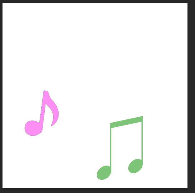 I then changed the colour of the music note I did this by selecting the, 'paint bucket tool' and choosing the colour light pink. I then clicked on the image and it changed to my chosen colour which in this case is light pink.
 I then selected a font by using the website dafont.com
choosing the font type called was, ‘HairyFun’.
I then chosen a font that fitted with this radio station which in this case is, 'Pulse'.
I then selected a font by using the website dafont.com
choosing the font type called was, ‘HairyFun’.
I then chosen a font that fitted with this radio station which in this case is, 'Pulse'. Next I changed the size of the font by using the, 'text tool' which allowed me to changed the size of the font size.
 I then changed the colour of the font by selecting the colour I wish to use which in this case is the colour black. I also changed the placing of the font to make it appear more youthful, appealing and interesting to the audience.
 After this I changed more of the font's letter to make it more clear and appealing to the audience.
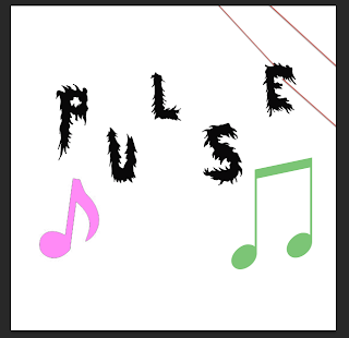 Next I added a background to my logo which was adding a red line by using the, 'shape tool' and selecting the line shape which allowed me to place the shape where I wished. I also changed the colour of the line by selecting the colours and choosing the colour red.
 I then kept adding the line in the background to make the logo appear more professional and colourful to the audience.
 After I did this I added a black line by selecting the, 'shape tool' and selecting the shape of the line, also I changed the colour to black by selecting the colour in the range of colours.
  I then added the word, 'OW!' I did this by using the website, 'dafont.com' and downloading the font type, 'Moon flower' I then began using the text tool and selecting where I wished my font to be place. I then finished my logo for, 'Pulse radio station'.
 Www (What went well): The logo is related to a radio station as it contains music notes which links to playing music. Therefore this logo is clear about what it is about and what it plays, the logo is also appealing as it contains bright colours and a bold text which will attract a wider audience.
Ebi (Even better if): I could improve this logo by making the background more bold. I could do this by changing the size of the shape of the line, this is done by holding by ,'CMD and T' as well as, 'sift'. therefore I can improve this logo by making the background more bold and appealing.
Lock Radio Station.
 I first began by searching on the internet of a image of a, 'key hole' I then saved my chosen image and opened it onto Photoshop.
 I then made the image larger and keeping the propitiations the same. I did this by holding, 'CMD and T' then, 'Sift'.
  Next I changed the background of the logo by selecting the, 'Paint bucket tool' and choosing the colour white which allowed me to change the colour of the background to change it to a white background.
 I then selected a font using the website, 'dafont.com' which I then chosen a font on this website which is called, 'Cute love'. This font type would appear appealing and professional for my logo design. I then added the chosen font to my logo by selecting the, 'Text tool' and clicking on the area I wished the text to be place.
 I then made the text larger by using the, 'Text tool' and changing the size of the text which is at the top of the menu. (The size I have chosen was 72).
 And I then completed typing my font for my logo which you can see here.
 I then changed the colour of the font by selecting the, 'Text tool' and choosing the colours I would like to use for my font. (I used individual colurs for each of the four letters this is so the logo appears more bright, youthful and positive to the audience).
 Next I made the image of the key hold more bold I did this by selecting the, 'Paint brush tool' and choosing the colour black which I then slowly clicked on the areas which I wished to change colour to seem more bold and clear for the audience.
 I then added the font, 'OW!' to the logo, I did this by using the, 'Text tool' and clicking on the area where I wished the font to be placed.
 After this I added a background so my logo appeared more interesting to the audience. I did this by selecting the, 'Shape tool' and selecting, 'Line' which allowed me to put the line where I wished. Once I have completed this I have finished my logo for, 'Lock radio station'.
Www (What went well): My logo is clear to the audience of what it is and the font used which appeal to many appeal as it suggests that this radio station is positive as the use of colours and bright. (The use of bright colours suggests it is positive, happy and cheerful).
Ebi (Even better if): My logo could be improved my changing the image I used this is because the outside of the image, (the lock hole) appears rough and organized. Therefore I could improve this logo by selecting a different image so my logo appeared more professional and appealing to the audience.
Health And Safety For Each Ident.
Playground ident:
Also for sound and music decisions for this
ident we will use up beat music what sounds positive and interesting this is so
the audience will want to watch this ident more if the music played appeals to
the audience. And for this ident we will use music that is copyright free
because the ident will appear more original if we use music that the audience
have not heard before. Also in this ident there will be a narrator speaking in
the background, this is so the audience clearly know what will be appearing
next on the channel.
Painting ident:
For sound and music decisions in this ident we will use fast paces music in order for the ident to appear more interesting and lively. This is so the audience will want to watch the ident, more which will then lead to our ident appearing more appealing if more people wish to watch it. And for this ident we will use music that is copyright free because the ident will appear more original if we use music that the audience have not heard before.
Kitchen ident:
For sound and music decisions in this ident we will use slow pace music with no copyright this is so our music is unique and more appealing if the audience have not heard the music before. And with a narrator speaking in the background, this is so the audience clearly know what will be appearing next on the channel.
Sparkler ident:
For sound and music decisions in this ident we will use calm and relaxed music as the prop used in this ident will be slowly used therefore the prop used relates to the music, (calm, slow and relaxed), also the music selected will not be copyright this is so our ident is more original and appealing to the audience if we have used music that the audience have not heard before. Also for this ident there will be a narrator speaking this is so the audience clearly know what will be appearing next on the channel and so our ident appears more professional if both music and narration is used.
Painting ident:
For sound and music decisions in this ident we will use fast paces music in order for the ident to appear more interesting and lively. This is so the audience will want to watch the ident, more which will then lead to our ident appearing more appealing if more people wish to watch it. And for this ident we will use music that is copyright free because the ident will appear more original if we use music that the audience have not heard before.
Kitchen ident:
For sound and music decisions in this ident we will use slow pace music with no copyright this is so our music is unique and more appealing if the audience have not heard the music before. And with a narrator speaking in the background, this is so the audience clearly know what will be appearing next on the channel.
Sparkler ident:
For sound and music decisions in this ident we will use calm and relaxed music as the prop used in this ident will be slowly used therefore the prop used relates to the music, (calm, slow and relaxed), also the music selected will not be copyright this is so our ident is more original and appealing to the audience if we have used music that the audience have not heard before. Also for this ident there will be a narrator speaking this is so the audience clearly know what will be appearing next on the channel and so our ident appears more professional if both music and narration is used.
Subscribe to:
Posts (Atom)