Tuesday, 26 November 2013

Pulse radio station logo.


 I first began by adding a music note I did this by selecting, 'custom shape' and choosing which shape to use, I then chosen the music note. After this I wished to change the colour of the design to make it more appealing I did this by selecting the, 'paint bucket tool' and choosing the colour green. I then clicked on the music note and it turned to my chosen colour which in this case is green.

 After this I changed the colour of the background by selecting the, 'Paint bucket tool' and choosing the colour white. I then clicked on the background and it turned to my chosen colour which in this case is white.

 I then search on the internet for an image of different type of musical note.I then saved the image to my personal file which I then open onto Photoshop, I then enlarged the image so it was more clear to see by the audience I did this by holding, 'CMD and T' and then holding, 'Sift' which allowed the image to keep the propitiations the same, even if the image has changed in size.
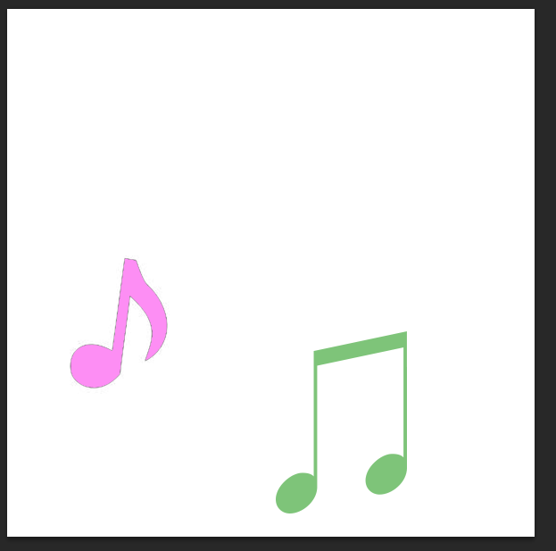
 I then changed the colour of the music note I did this by selecting the, 'paint bucket tool' and choosing the colour light pink. I then clicked on the image and it changed to my chosen colour which in this case is light pink.

 I then selected a font by using the website dafont.com choosing the font type called was, ‘HairyFun’.  I then chosen a font that fitted with this radio station which in this case is, 'Pulse'.

 Next I changed the size of the font by using the, 'text tool' which allowed me to changed the size of the font size.

 I then changed the colour of the font by selecting the colour I wish to use which in this case is the colour black. I also changed the placing of the font to make it appear more youthful, appealing and interesting to the audience.

 After this I changed more of the font's letter to make it more clear and appealing to the audience.
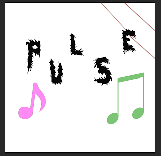


 Next I added a background to my logo which was adding a red line by using the, 'shape tool' and selecting the line shape which allowed me to place the shape where I wished. I also changed the colour of the line by selecting the colours and choosing the colour red.

 I then kept adding the line in the background to make the logo appear more professional and colourful to the audience.


 After I did this I added a black line by selecting the, 'shape tool' and selecting the shape of the line, also I changed the colour to black by selecting the colour in the range of colours.


I then added the word, 'OW!' I did this by using the website, 'dafont.com' and downloading the font type, 'Moon flower' I then began using the text tool and selecting where I wished my font to be place. I then finished my logo for, 'Pulse radio station'.


Www (What went well): The logo is related to a radio station as it contains music notes which links to playing music. Therefore this logo is clear about what it is about and what it plays, the logo is also appealing as it contains bright colours and a bold text which will attract a wider audience.

Ebi (Even better if): I could improve this logo by making the background more bold. I could do this by changing the size of the shape of the line, this is done by holding by ,'CMD and T' as well as, 'sift'. therefore I can improve this logo by making the background more bold and appealing.


Lock Radio Station.

 I first began by searching on the internet of a image of a, 'key hole' I then saved my chosen image and opened it onto Photoshop.

 I then made the image larger and keeping the propitiations the same. I did this by holding, 'CMD and T' then, 'Sift'.

 Next I changed the background of the logo by selecting the, 'Paint bucket tool' and choosing the colour white which allowed me to change the colour of the background to change it to a white background.

 I then selected a font using the website, 'dafont.com' which I then chosen a font  on this website which is called, 'Cute love'. This font type would appear appealing and professional for my logo design. I then added the chosen font to my logo by selecting the, 'Text tool' and clicking on the area I wished the text to be place.

 I then made the text larger by using the, 'Text tool' and changing the size of the text which is at the top of the menu. (The size I have chosen was 72).

 And I then completed typing my font for my logo which you can see here.

 I then changed the colour of the font by selecting the, 'Text tool' and choosing the colours I would like to use for my font. (I used individual colurs for each of the four letters this is so the logo appears more bright, youthful and positive to the audience).

 Next I made the image of the key hold more bold I did this by selecting the, 'Paint brush tool' and choosing the colour black which I then slowly clicked on the areas which I wished to change colour to seem more bold and clear for the audience.

 I then added the font, 'OW!' to the logo, I did this by using the, 'Text tool' and clicking on the area where I wished the font to be placed.

 After this I added a background so my logo appeared more interesting to the audience. I did this by selecting the, 'Shape tool' and selecting, 'Line' which allowed me to put the line where I wished. Once I have completed this I have finished my logo for, 'Lock radio station'.


Www (What went well): My logo is clear to the audience of what it is and the font used which appeal to many appeal as it suggests that this radio station is positive as the use of colours and bright. (The use of bright colours suggests it is positive, happy and cheerful).

Ebi (Even better if): My logo could be improved my changing the image I used this is because the outside of the image, (the lock hole) appears rough and organized. Therefore I could improve this logo by selecting a different image so my logo appeared more professional and appealing to the audience.

Health And Safety For Each Ident.

Playground ident: Also for sound and music decisions for this ident we will use up beat music what sounds positive and interesting this is so the audience will want to watch this ident more if the music played appeals to the audience. And for this ident we will use music that is copyright free because the ident will appear more original if we use music that the audience have not heard before. Also in this ident there will be a narrator speaking in the background, this is so the audience clearly know what will be appearing next on the channel.


Painting ident:

For sound and music decisions in this ident we will use fast paces music in order for the ident to appear more interesting and lively. This is so the audience will want to watch the ident, more which will then lead to our ident appearing more appealing if more people wish to watch it. And for this ident we will use music that is copyright free because the ident will appear more original if we use music that the audience have not heard before.


Kitchen ident:
For sound and music decisions in this ident we will use slow pace music with no copyright this is so our music is unique and more appealing if the audience have not heard the music before. And with a narrator speaking in the background, this is so the audience clearly know what will be appearing next on the channel.


Sparkler ident:

     For sound and music decisions in this ident we will use calm and relaxed music as the prop used in this ident will be slowly used therefore the prop used relates to the music, (calm, slow and relaxed), also the music selected will not be copyright this is so our ident is more original and appealing to the audience if we have used music that the audience have not heard before. Also for this ident there will be a narrator speaking this is so the audience clearly know what will be appearing next on the channel and so our ident appears more professional if both music and narration is used.

Roles Descriptions For Each Ident.

      
Playground ident:
For this ident my role, (Clare O’Mara) will be control of directing where the props will be placed and we in control of what sound/music will play during this ident. Also Daniel’s role will be controlling the camera this is because we will need to make sure we film the correct shots at the right time and place of the ident. Also Daniel and myself will be in control of editing the ident this is so we can change anything we do not wish to show in the ident and so the ident appears more professional and appealing to the audience watching.


Painting ident:

    This ident my role will be controlling the camera making sure I capture the correct shots when wished so also I will be in control of the lighting this is so the audience clearly know what is happening in this ident and so the ident appears more appealing if the lighting is used correctly. Also Daniel’s role for this ident will be directing where the paints will be placed in which part of the ident and Daniel’s role for this ident will be sound control this is so the correct music is played for this ident and so the music fits with the ident in a positive way. We will be playing music as the ident will appear more professional and so the audience will enjoy the ident more.


Kitchen ident:

   For this ident my role is to control the camera this is so that all the correct props are being seen at the correct time in the ident. I will also be selecting and controlling the music/sound as if the correct music is not select it could make the ident appear unclear to the audience of what the ident is about. And Daniel’s role will be lighting to make sure the ident is clear to the audience, directing where the props should be placed in this ident and editing the ident this is so the ident appears professional and more appealing to the audience if the ident is edited.


Sparkler ident:
     In this ident my role is sound control this is so the correct music is selected and the narrator speaks at the correct time in the ident, I will also be controlling the camera making sure the main prop is being filmed at the correct time in the ident. So Daniel’s role for this ident is to director where the prop, (the sparkler) will be at which point of the ident this is important because the prop must be clear to see by the audience as if it is not clear the audience will not wish to watch the ident. Daniel and myself will be in control of editing the ident this is because there may be parts of the ident that might not be clear to the audience therefore we will edit out the ident so the ident becomes more clear and appealing. And there will be no lighting control for this ident, as we will be filming outside so we cannot control the lighting as natural lighting only controls this area.

Locations for idents.


Playground ident:
   
      For the ident where we are filming  outside in the playground area which we are filming in Glenthorne High School this is because this area we are filming has a lot of space which means we can use many props and any size of props which will make our ident appear more professional as we are using a lot of props and we have a lot of space to film the ident in which is easy for us to move around and to move props around quickly and easily. The room/area we are filming in is outside it has plenty of space and we will film during day time which means there will be natural lighting in this area. For health and safety we must make sure we be careful with the equipment we will use as if one of us fall over the equipment we could injure ourselves and break the equipment we are using for this ident. Therefore to make sure we do not injure ourselves we must make sure we watch what we are doing at all time in order not to harm ourselves or others.

Painting ident:

       The painting ident will be filmed in Glenthorne High School in a art classroom in the school. This room will be used as it links to the ident. (This ident is about painting and we will be filming where people paint).  Also the room where we will film has a lot of space so we can move around if needed so. And we can control the lighting in this room as we can turn the lights off and on when wished so and we can open and close the curtains when we want to. This shows we can either control natural light in the room or make the room clearer to see by switching on eclectically lights. For the health and safety for this ident is that we must all chairs underneath tables this is so we do not fall over any chairs we could lead to injure or damaging equipment and we must make sure when filming we watch what we do at all times in order to produce the best quality of an ident and make sure ourselves or others do not get injure in any way.


Kitchen ident:


        For this ident we will be filming in Glenthorne High School in one of the classrooms which will be the kitchen this is because out ident involves props which is used in the kitchen therefore this is so our ident links to the scene and is clear to the audience what it will be about. This room is larger and has many props such as kitchen unities, chairs and tables that will be useful for this ident.  Also it means there is plenty of space for us to move and film the ident that is be helpful in order to create a successful and appealing ident. And the health and safety issues for this ident is that we must make sure all chairs must be underneath the tables this is because we will not want to injure ourselves or damage the equipment we will be using as if we are injure or damaged the equipment then we can not complete the ident successfully.


Sparkler ident:

 
       In the ident we will be filming outside Glenthorne High School in the field. This then gives us a wide range amount of space for us to film and use the experiment. Therefore the area/room where we will be filming is a large field with a large amount of spacing. But the health and safety issues is that local people may be coming though the field of where we will be filming so to make sure no one gets injured we must be aware of others and all experiment is not in the way of people this is so other people do not get injure, our selves do not get injured or that any of the experiment does not break.

Target audience genre.


Here is the target audience genre for my radio stations logo. This is important because target audience genre makes my radio station's logos more professional and appealing to each target audience.

Tuesday, 19 November 2013

Target audience genre-Radio stations logos I will create.


               The name I have chosen is, 'Vibe' this is because it suggests the radio stations supplies a range of different types of music subtitle for all ages. Also the word, 'Vibe' means vibrant/vibrations which could be produced by music which relates to what this radio station is about which is producing music which relates to what the radio station is about. (Which is producing music for audiences in a positive way). Therefore then name, 'Vibe' will make people believe that this radio station plays upbeat and fun music along side colouful logos which appeals and suitable for many different age groups.


      The design I have chosen to create for, 'Lock' radio station is my third design  this is because this logo is not bright, overpowering or childish but it is interesting and appealing. Also this logo is aimed for teenage male and females this is because the logo does not contain to much colour but it contains a correct amount of text and colour so it will appeal to this age group. The type of music played on this radio station will be R&B this is because R&B music is youthful, fun and positive reflects on my target audience which is people aged 16-25 year olds of both genders


      The design I have chosen to create for, 'Pulse' radio station is my second design this is because it is clear to read and will appeal to people as it contains bright colours that will draws the audience's attention.Also this logo is aimed for male and female adults this is due to the fact it does not contain to much colour but the colour used for the background will still interest this target audience as the logo appears to be serous.  The type of music played on this radio station will be club music this is because club music music is youthful, fun and positive reflects on my target audience which is people aged 18-30 years of age.


       The design I have chosen to create for, 'Buzz' is my first design this is because it is bright and eye catching which will make more people want to listen to the radio station more. Also this logo is aimed for female teenagers as it contains colours that are sterotyped to appeal to females this is because the colours pink and purple are stereotyped to appeal to female teenagers.The type of music played on this radio station will be pop this is because pop music is fun and positive which relates back to my target audience which is young children aged 5-10 years of age.