Here the audience can clearly see that the music begins as soon as the music video begins. Therefore the music video is the soundtrack to the whole video, it starts and ends when the music in the video starts and ends.
Here the audience can clearly see more then 3 or 4 different locations. Also the locations change with each verse/chorus this is so the video appears more appealing, professional and interesting to the audience watching the music video.
In this clip the audience clearly see the character's costume. The costume in this music video shows status and authority. This is due to the fact the character is seen wearing a black suit which suggests the character is in a serious situation or a serious job.
This music video does contain a narrative, often intercut with performance shots. A narrative is very important in a music video so the video becomes more interesting to watch for the audience. This is due to the fact that this music video is about a FBI male worker who deals with suicides but the audience can slowly see by the use of emotions of shots that this FBI worker is slowly be affected which leads this character taking his own life which is shown at the end of the music video.
 This video does contain use of high angles which does create an atmosphere this is due to the fact the audience see the FBI male looking down at the audience. This shows that the male has high status as he is seen looking down at the audience which shows he has power whereas the audience lack power.
This music video does connect eith the audience this is due to the fact the audience watch the male character though out the video and saw the sad emotions of the characters and to find out that this character has committed suicide makes the audience feel sad as they connected with this character. Therefore the audience have emotionally connected with the character/s in this music video.
 For this music video the character is making eye contact with the audience this is because the main character is seen sitting on the chair looking at the audience. as well as expressing sad emotions which then creates a sad/depressed atmosphere. Therefore the character making eye contact suggests that this character is reaching out for help as the character is seen sitting alone which reflects on the facial expressions of the characters. Therefore eye contact is seen in this music video as it creates an atmosphere for the audience or makes the audience connect with the characters more.
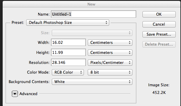 I first began by selecting the size for the layout of the logo. I made sure it was international paper, transparent and included my name.
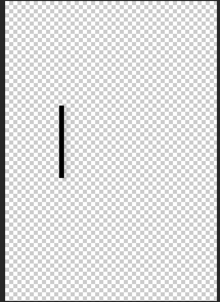 I then added a line using the, 'shape tool' and selecting the line shape. This allowed me to add the shape of the line where I wished. I also changed the width and length of the shape to make it more clear and bold to the audience.
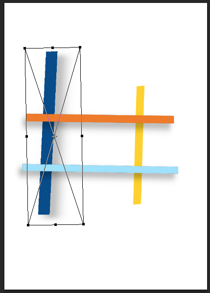 I decided to change the colours of the lines to be more colourful and bright this is so the logo appears more positive and youthful. I then added three more lines by using the, 'shape tool' which allowed me to select the shape of the lines and place where I wished. I changed the colours of the lines by selecting the colour above where of the Photoshop software. Once I selected the chose colour I finished adding the shapes of the lines to the logo of The Grid. I also added a white background to the logo to make the logo stand out more, I did this by using the, 'paint bucket tool' and selecting the colour white. I then selected the background of the logo by clicking on the background of the logo after this my background for the logo of The Grid was completed.
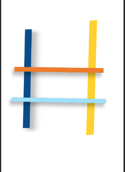 I then changed the width and the length of each line to make the logo appear more bold and clear to the audience. I did this by holding down on the keypad, 'CMD and T' then, 'Sift' this is so the proportions of the image stayed the same.
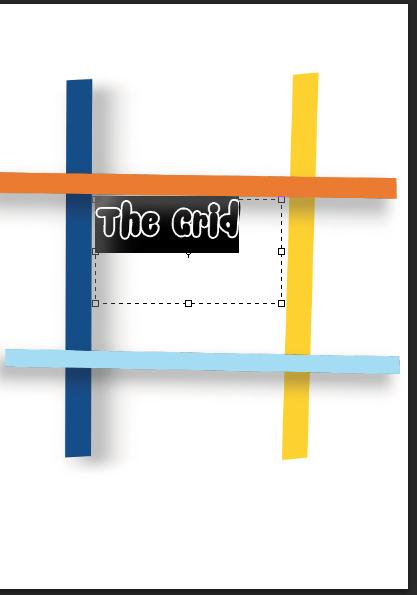 I then added text using the website www.Dafont.com. Which I then downloaded the font style, 'Snacker Comic'. I decided to use this font style because it appears professional and appealing to the target audience.
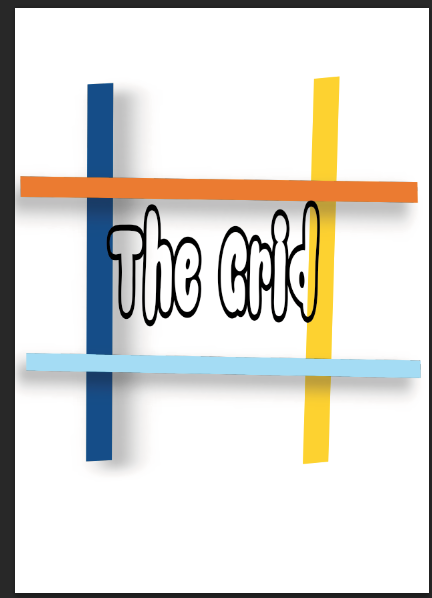 I then changed the width and size of the text by using the, 'palette tool' this allowed me to change the width and length of the text to how I wished.
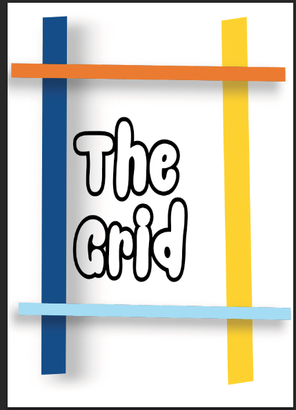 I then completed adding the text to the logo this is so the logo appears more clear to read by the target audience.
 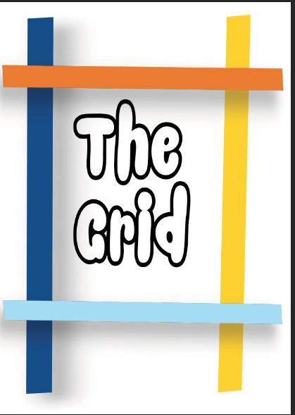 I then finished changing the size of the lines and changing the size of the text this is so The Grid logo appears more appealing and professional to the target audience. Here is the completed logo for, 'The Grid'.
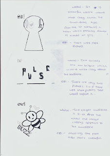
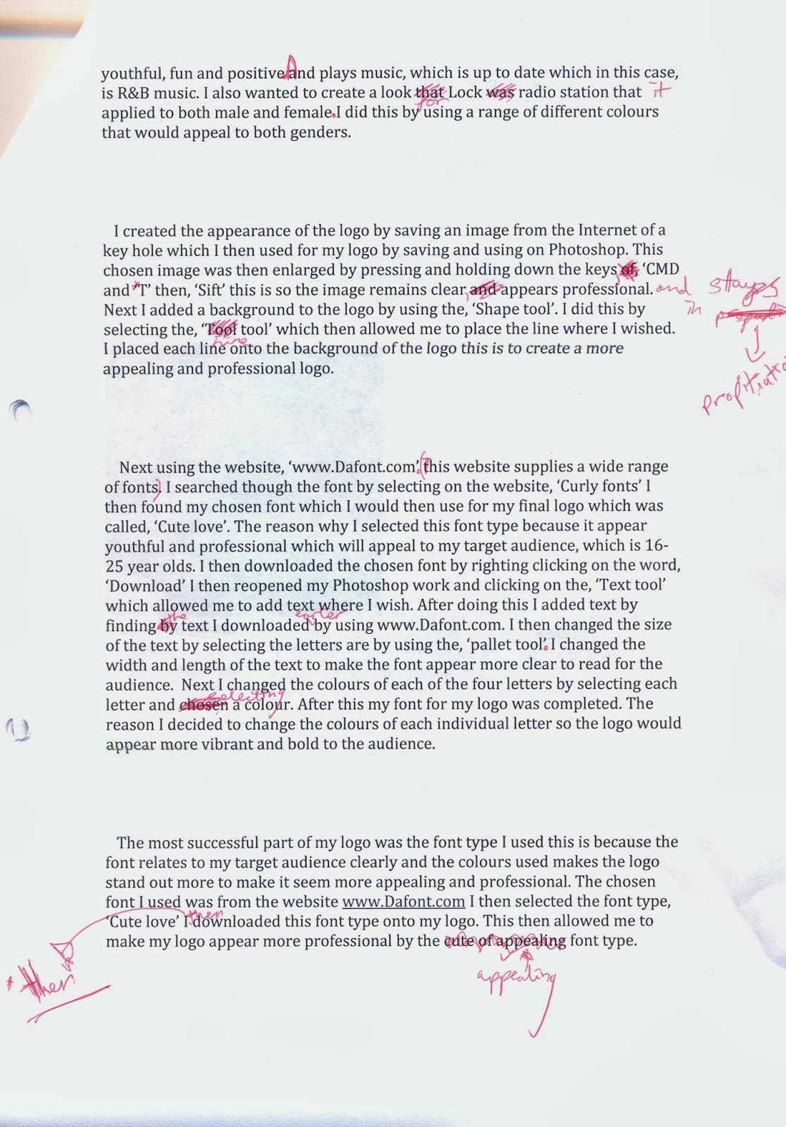
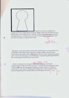
 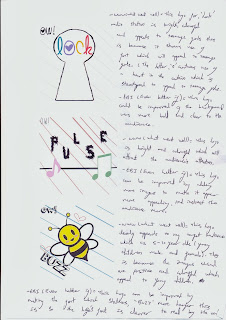 (Here are all three of my logos put together this is so my peers can evaluate the logos and see what all the logos appear when in full colours).